
")


Templates
I denna sektion lär du dig bemästra skapande av effektfulla templates att visa upp på dina skärmar.
Templates erbjuder ett anpassningsbart och effektivt sätt att kommunicera ut dina budskap. I PicFlows templateverktyg kan du kombinera text med olika typer av media, samt widgets så som klocka, trafikinformation och väder. Du kan skapa designer som passar med din organisations designpreferenser samt färg- och formval.
💡 Tips! Du vet väl att du kan lägga upp er organisations färger och typsnitt, för att sedan enkelt komma åt och använda dem i template editorn? Lär dig hur här.
Vad är Templates?
Flödet för att visa upp skärminnehåll i PicFlow kan beskrivas som att varje skärm tilldelas en layout. Layouten i sin tur har areas, och dessa areas fyller vi med innehåll. Innehåll kan vara mediefiler, så som bilder och rörligt material, eller templates, som vi bygger av olika widgets.
Templates i PicFlow är alltså ett verktyg för att kombinera olika designelement för att skapa templates, eller mallar, att visa upp skärmens areas, ytor. Du kan kombinera text, mediefiler och PicFlows breda utbud av widgets.
📖 Längre ned i denna sektion går vi igenom funktionaliteten av alla widgets. Navigera till en widget av intresse via den vänstra sidomenyn.
Templates är också ett sätt att undvika repetitivt arbete. Du kan återanvända dina templates på flera skärmar, och modifiera dem beroende på det budskap du vill förmedla. Du kan både skapa och hantera dina templates i sektionen Templates.
Navigera till Templates

Navigera till Templates via den gula sidebaren till vänster på skärmen.
Folders
Organisera dina templates i Folders, mappar, för ett mer strukturerat och lättöverskådligt arbetsflöde.

Du hittar mappar under “Folders”, i skärmens vänstra sektion.
💡 Vi rekommenderar att kategorisera mallarna i mappar baserat på specifika delar av dina layouter, vilket gör det enklare att hitta mallar som passar de olika delarna av din skärmlayout. Här är mapparna döpta efter ytorna i PicFlow standardlayout.
Skapa en mapp
1. Klicka på “+” tecknet i högra hörnet av “Folders”-sektionen.
2. Ett pop up-fönster dyker upp på din skärm. Ge din mapp ett namn.
3. Klicka på den röda “Create Folder” knappen.
Du har nu skapat en tom mapp.
Överblicka en mapp

Mappen ovan heter “Footer” och innehåller 1 templates.
Du ser anta templates en mapp innehåller vis templates-ikonen i det nedre högra hörnet på varje mapp.
Redigera en mapp

Klicka på de 3 vertikala punkterna och välj “Edit”.
En pop up-ruta dyker upp på skärmen, där du ges möjlighet att justera namnet på mappen. Klicka på den röda “Accept” för att spara dina ändringar.
Söka efter en mapp

Klicka på förstoringsglasikonen precis under rubriken “Folders” för att öppna ett inmatningsfält. Om din söktext är en del av ett mappnamn kommer mappen att visas i resultatlistan.
Skapa en mapp inuti i en annan mapp

Markera den mapp i vilken du önskar skapa en ny undermapp. Du markerar och väljer mapp genom att klicka på den .
💡 Den röda ramen markerar att mappen är vald.
Genomför nu, steg 1-3 för avsnittet “Skapa en mapp”. Navigera dit genom att klicka här.
Flytta templates till en mapp
Nedan går vi igenom hur du flyttar templates mellan mappar. I PicFlow kan du flytta en eller flera templates på samma gång.
Flytta en template

I det här exemplet har vi en template “Kontakt” som vi vill flytta till rätt mapp. Just nu ligger den i “Templates without folder”.
💡 I “Templates without folder” hamnar alla templates som inte tilldelats en mapp.
 Alternativ för din valda template blir synliga i den högra sidopanelen. Klicka på “Move template”.
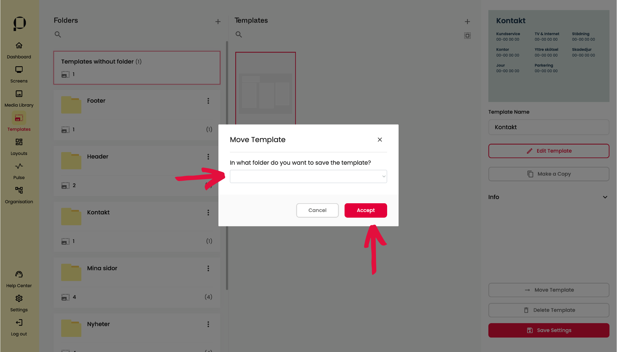
Ett pop up-fönster visas på skärmen, där du kan välja till vilken mapp du vill flytta din template. När valt en mapp, klicka på “Accept” för att bekräfta förflyttningen av din template.
Flytta flera templates
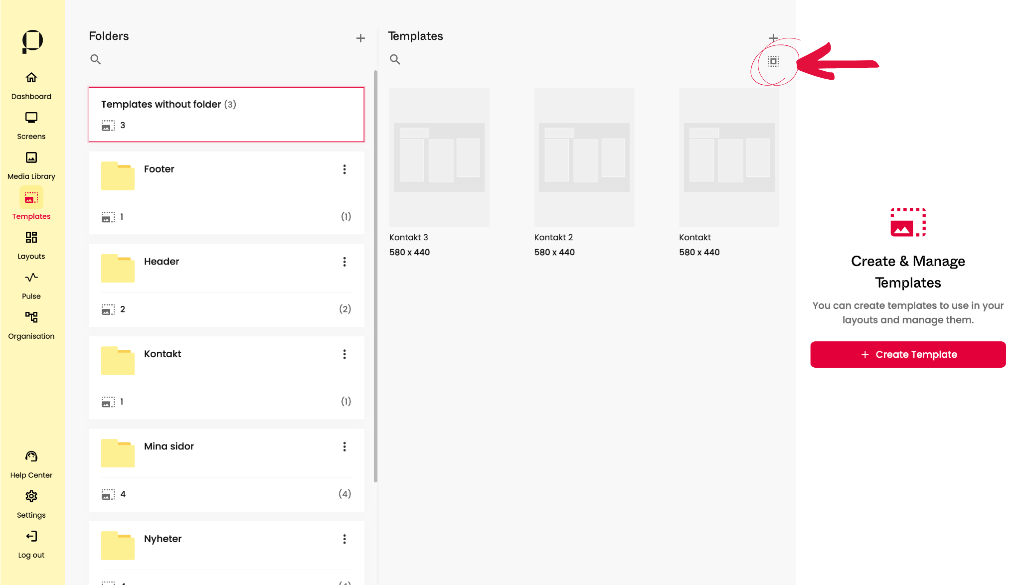
I det här exemplet har vi 3 stycken templates som alla ska flyttas till samma mapp. Börja med att klicka på symbolen för select (den lilla rutan omringad av en annan streckad ruta).

Välj alla de templates du önskar flytta genom att klicka på dem . En röd ram visas runt dina valda templates, och antalet valda mallar syns i sidebaren på skärmens högra sida.
Klicka på knappen “Move Template“, längst ner i den högra sidopanelen.

Ett pop up-fönster visas på skärmen, där du kan välja till vilken mapp du vill flytta dina templates till. När valt en mapp, klicka på “Accept” för att bekräfta förflyttningen av dina templates.
Radera en mapp

Klicka på de 3 vertikala punkterna och välj “Delete”. En pop up-ruta dyker upp på skärmen. Klicka på den röda “Delete” för att ta bort mappen.
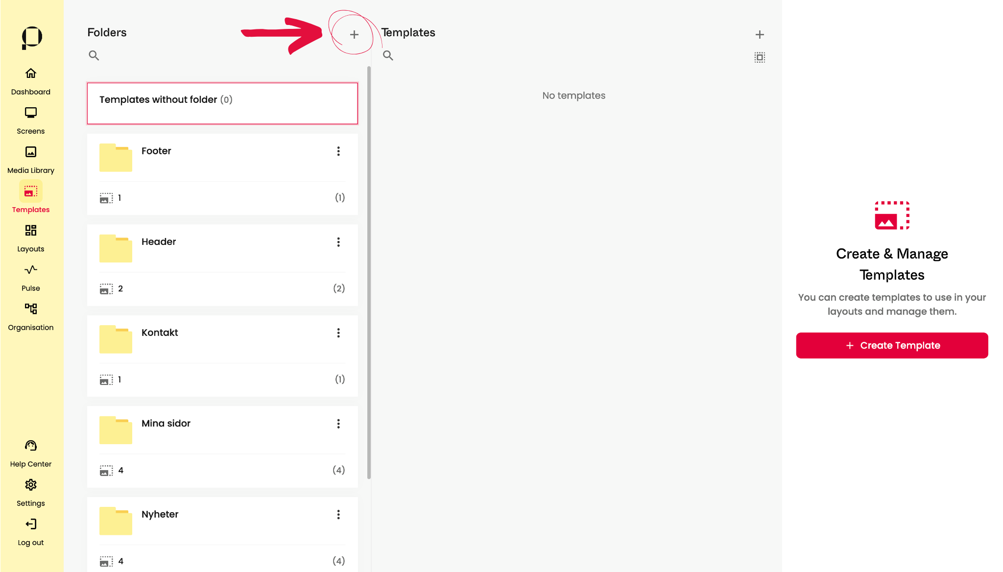
Templates
I skärmens högra sektion hittar du dina Templates.

Templates finns utplacerade i dina mappar. Klicka på en mapp för att visa de templates som ligger i den. Templates utan tilldelad mappar hamnar i “Templates without folder”.
Skapa en ny Template

1. Klicka på den stora röda knappen “Create Template” som finns mitt på skärmens högra sida.
💡 Ett annat alternativ är att klicka på det mindre plustecknet i Template-sektionen, till höger om rubriken Templates.
Båda alternativen öppnar samma popup-fönster.
2. Ett pop up-fönster visas på skärmen, där du kan ge ditt template ett namn.
3. Efter att ha döpt din template, klicka på den röda knappen “Create” för att spara dina ändringar.
Redigera eller hantera en Template
Markera en befintlig template genom att klicka på den, en röd ram runt objektet indikerar att en template är vald.
Alternativ för din template visas i sidopanelen på höger sida av skärmen.

Redigera templatens namn under “Template Name“.
💡 Glöm inte att spara förändringar av namnet, genom att klicka på den röda “Save Settings” knappen längst ner i sidopanelen.

Klicka på “Edit Template” knappen för att redigera din layout. Redigeringsvyn öppnas då upp på din skärm.
📖 Läs mer om redigeringsvyn i kommande avsnitt “Redigeringsvyn”, navigera dit genom att klicka här.

Klicka på “Make a Copy” för att duplicera den markerade templaten.
Ett pop up-fönster visas på skärmen. Ge duplikationen ett namn och välj vilken mapp du vill placera den i. Klicka på den röda knappen “Accept” för att skapa kopian. Du tas direkt till redigeringsvyn, där du ges möjlighet att redigera duplikationen. Du hittar duplikationen i din valda mapp, i Template bibloteket.
📖 Läs mer om redigeringsvyn i kommande avsnitt “Redigeringsvyn”, navigera dit genom att klicka här.
Redigera en template från en skärmplats
Vill du redigera en befintlig template direkt från en av dina skärmars ytor? Lär dig hur under rubriken “Hantera templates i en playlist” i User Guidens avsnitt för Screens, genom att klicka här. 🚀
Redigeringsvyn
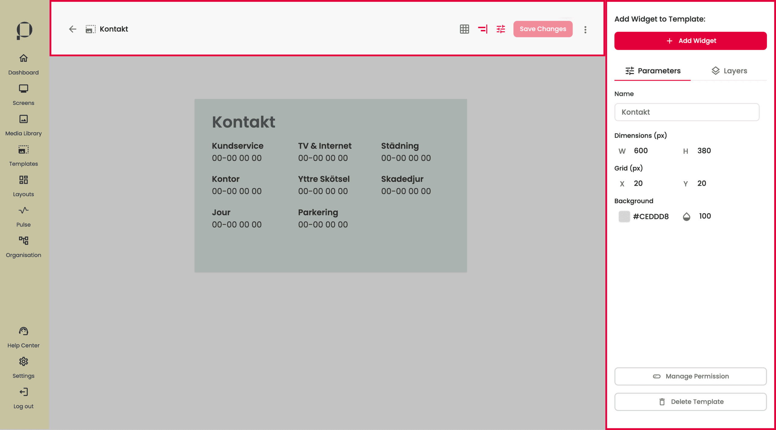
I redigeringsvyn har du tillgång till ett verktygsfält högst upp på skärmen, och en sidopanel på skärmens högra sida.
Verktygsfältet

Verktygsfältet hittar vi i skärmens ovankant. Längst ut till vänster ser du namnet på den template du redigerar.

Här ges vi möjlighet att visa upp ett rutnät ovanpå din template, aktivera ett snapping tool, eller justeringsverktyg, vilken underlättar vid placering av dina widgets. Klicka på ikonerna för att aktivera verktygen. När verktyget är aktiverat, blir ikonen röd. Båda verktygen kan vara aktiverade samtidigt.

Ikonen för inställningar visar inställningar för din template i sidopanelen till höger på skärmen.

Klicka på den röda “Save Changes” knappen för spara dina ändringar. Knappen tänds första när det finns förändringar i templaten.

Genom att trycka på de tre vertikala prickarna, ges du möjlighet att radera din template direkt i redigeringsvyn.
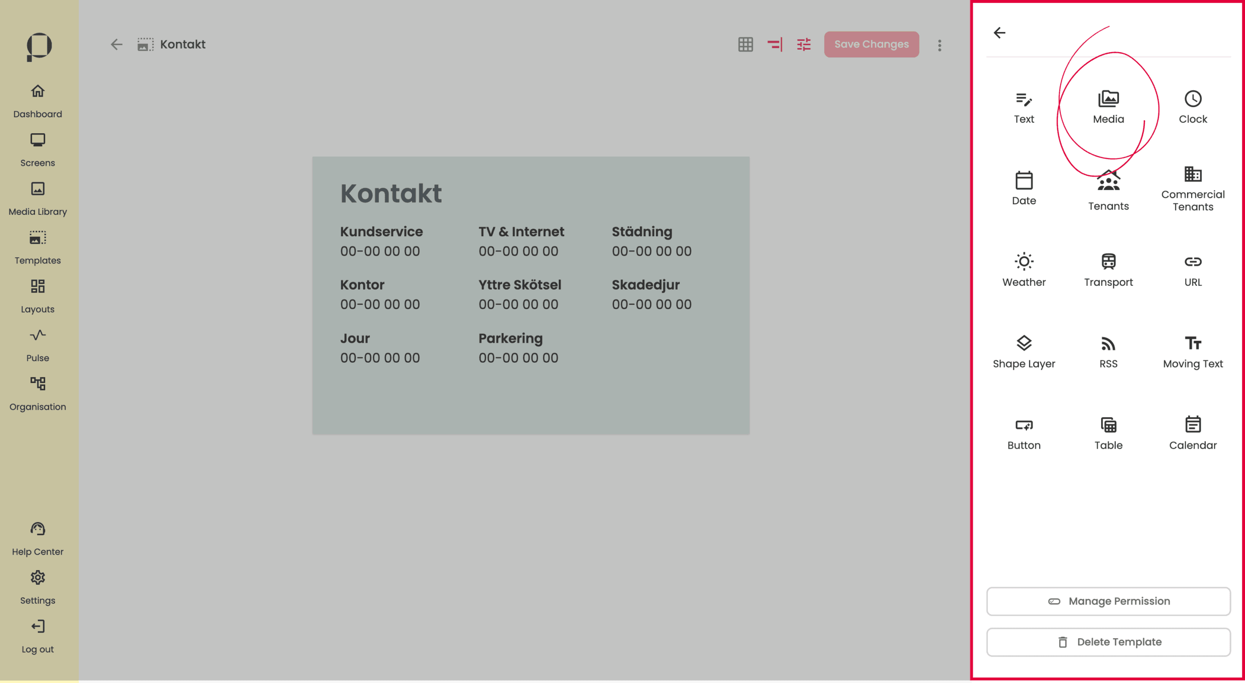
Sidopanelen

Högst upp i sidopanelen hittar du knappen som öppnar widgetbibloteket. För att läsa mer om att lägga till widgets, klicka här.
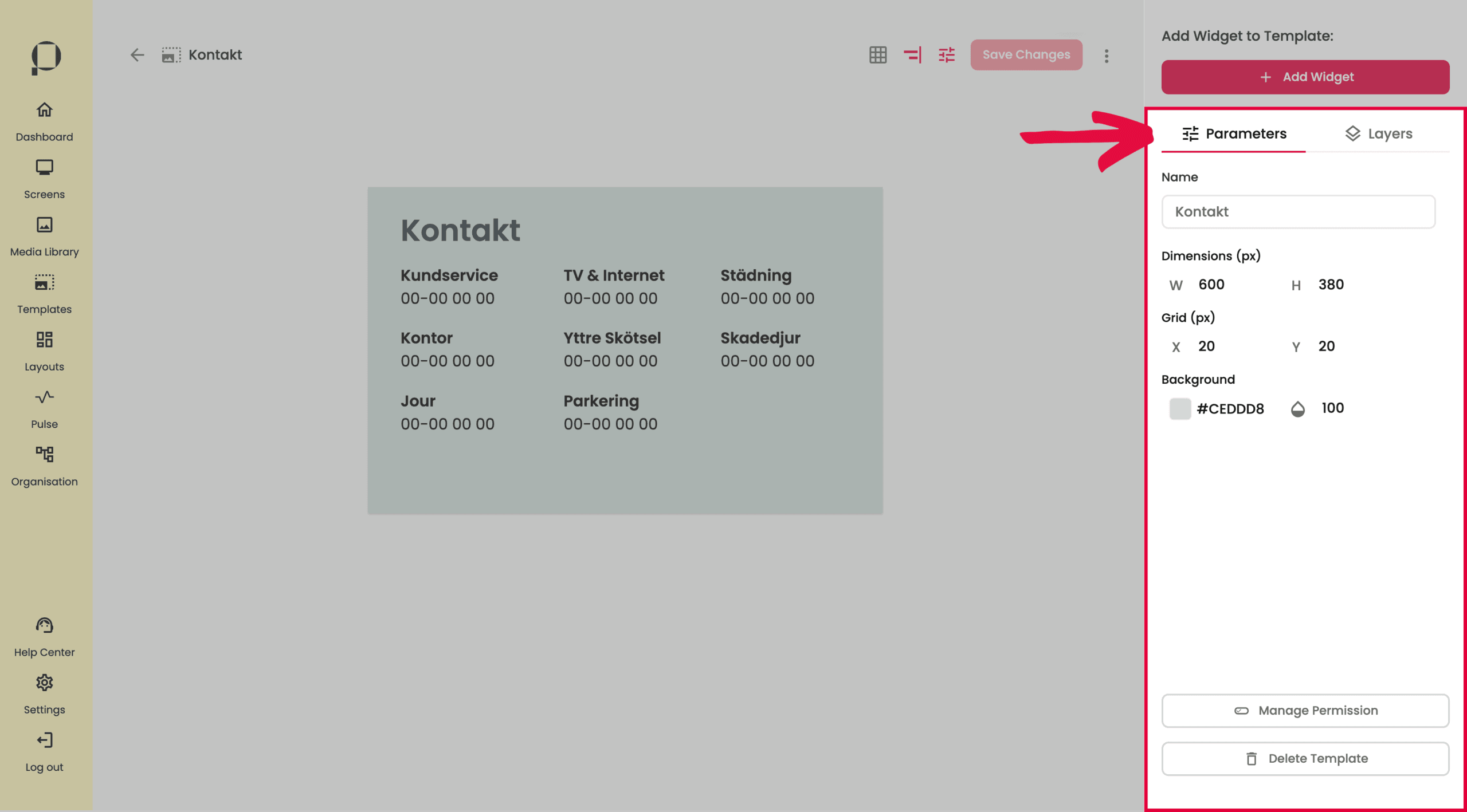
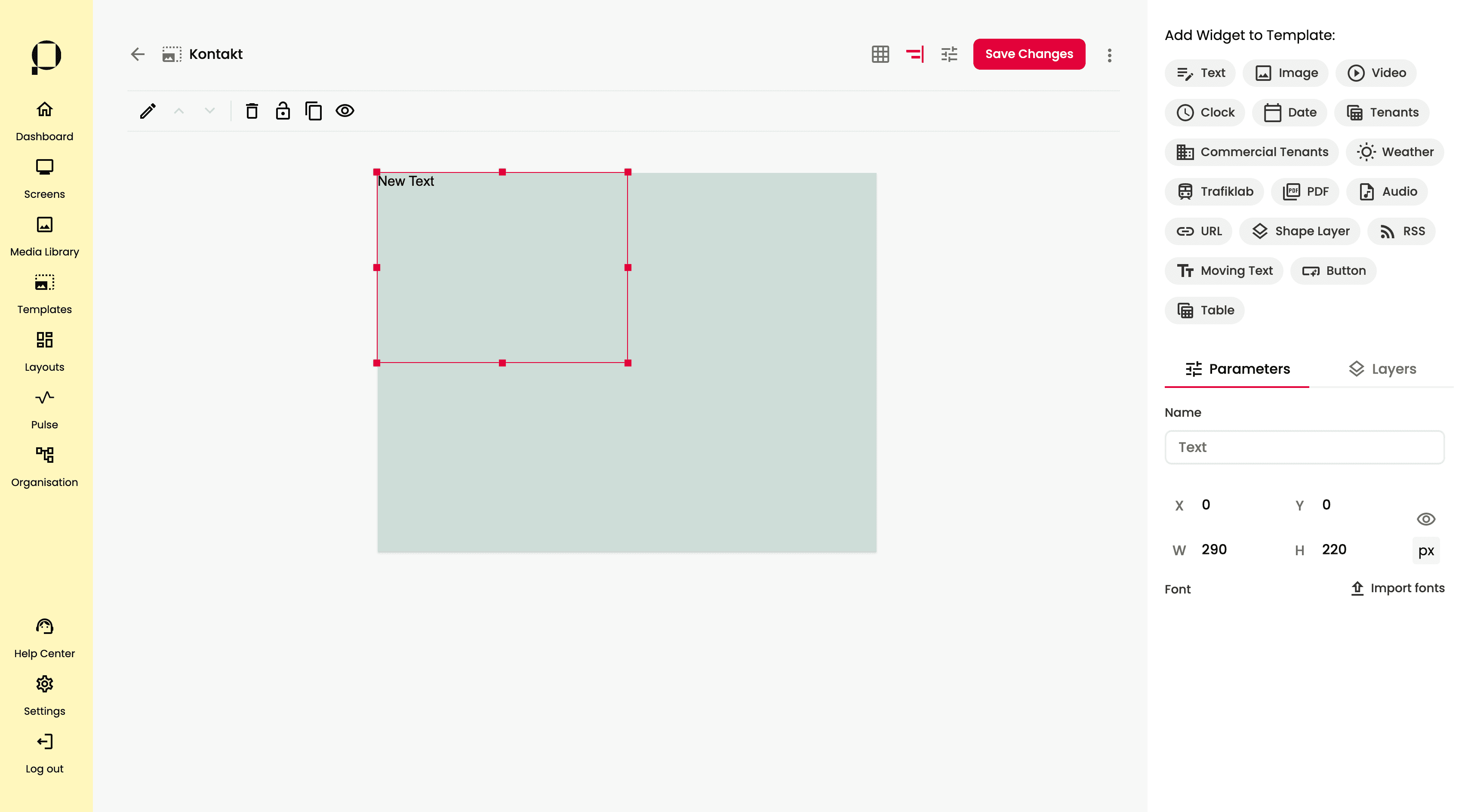
I sektionen Parameters kan du redigera namn, mått, rutnätsstorleken och bakgrundsfärg för din template.
💡 För att redigera parametrarna för en widget istället, markera widgeten genom att klicka på den.
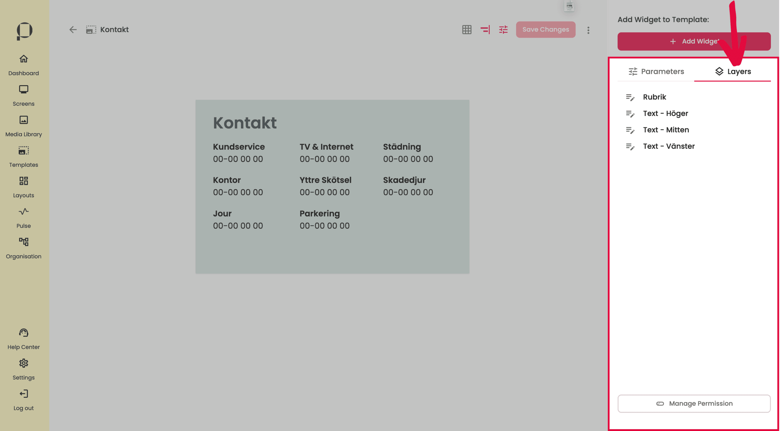
I sektionen Layers kan du se alla widgets i din template som lager, vilket ger dig full kontroll över vad som ingår i din template och vilka som ligger överst respektive underst. I den här templaten finns 4 widgets, alltså 4 layers.
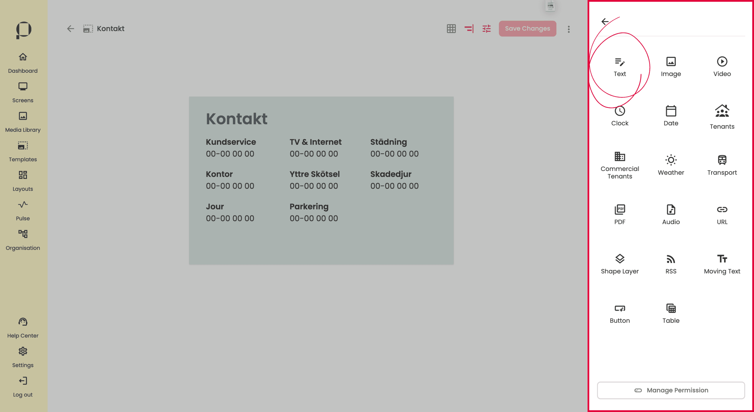
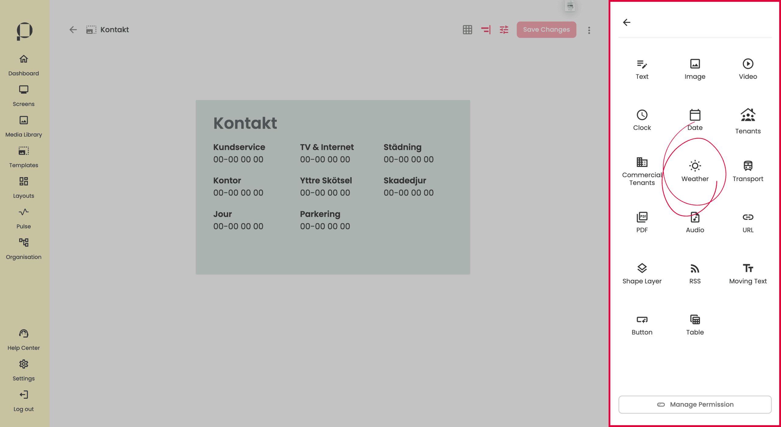
Lägg till widgets
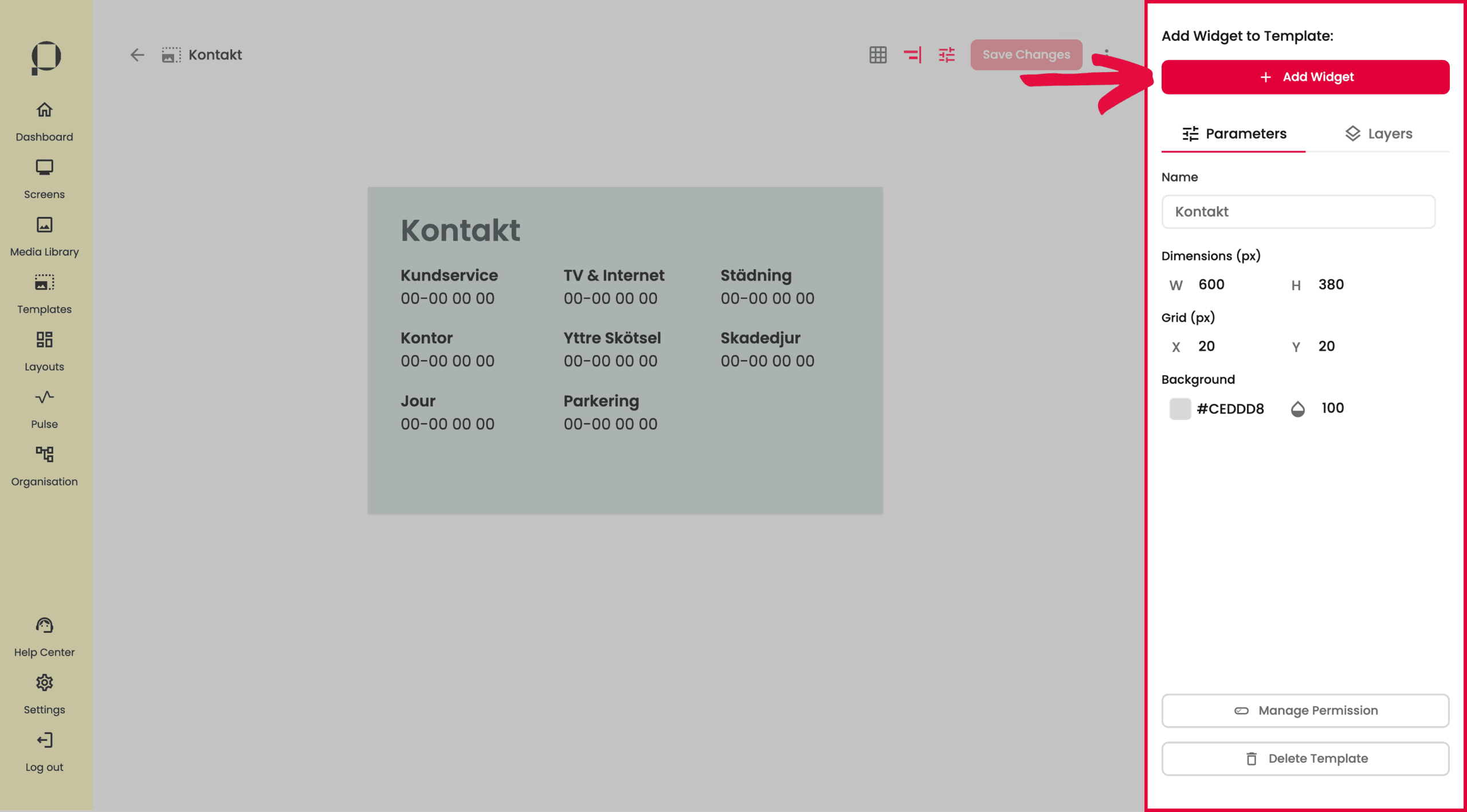
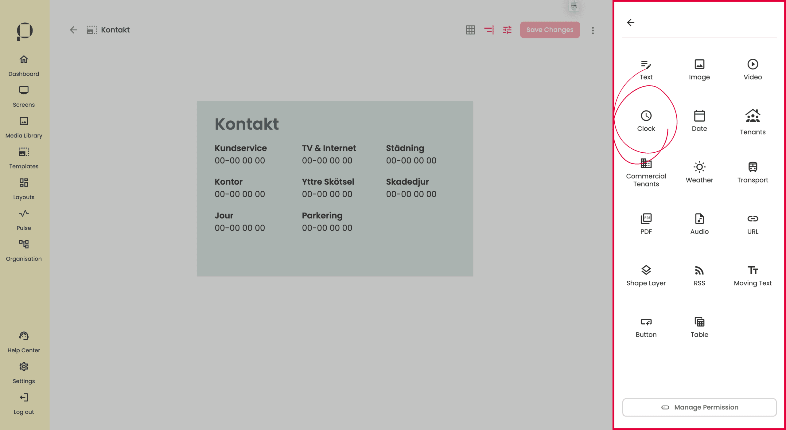
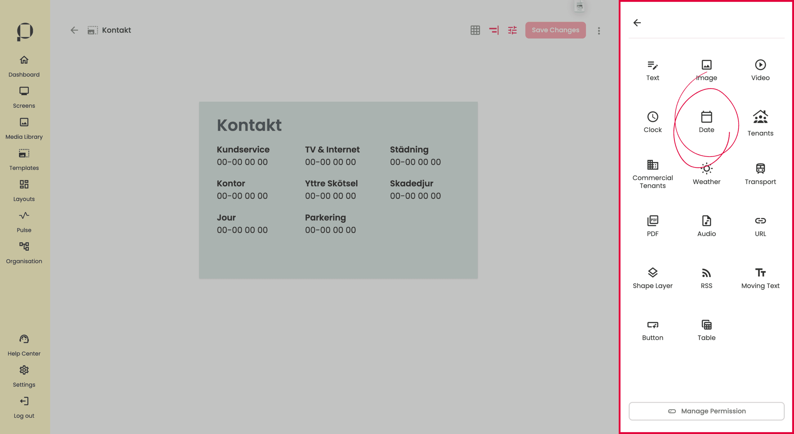
Klicka på knappen “Add Widget” för att öppna widget bibloteket.
📖 Osäker på hur man kommer till den här vyn i PicFlow? Hoppa upp några steg i guiden och börja istället från avsnittet “Skapa en ny template”. Navigera dit genom att klicka här.
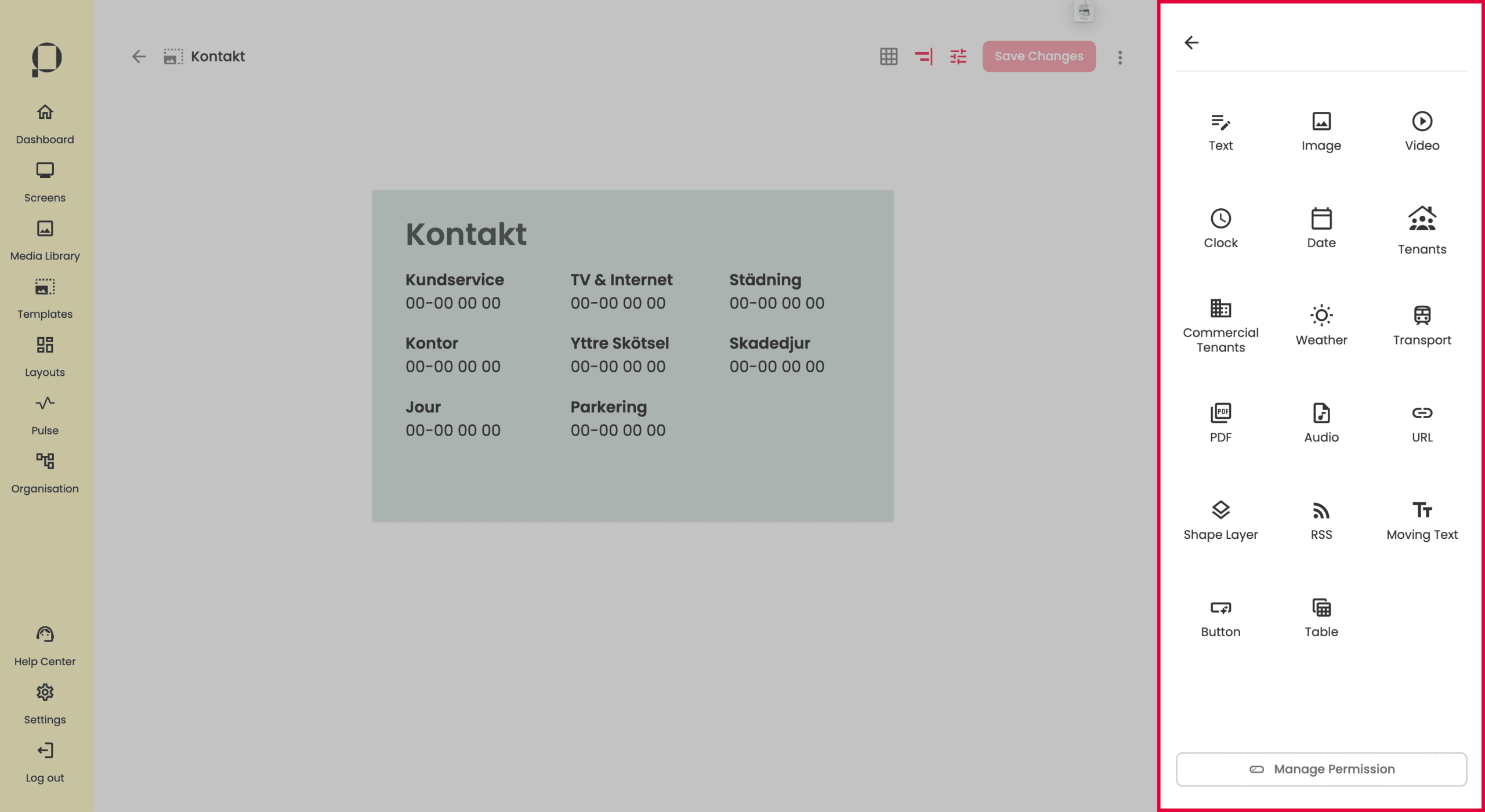
PicFlows widgets presenteras nu i sidomenyn. För guide till att hantera specifika widgets, navigera till avsnittet “Widgets” genom att klicka här.
Hantera widgets

När du lägger till och hanterar widgets i din template, visas en liten verktygspanel precis ovanför widgeten.
💡 Tips! Håll muspekaren över varje symbol i verktygsraden i PicFlow för att se en kort beskrivning av dess funktion.
I exemplet ovan hanterar vi ett textfält i vår template. Med hjälp av pilarna kan du justera ordningen på lagren och lägga din widget över eller under de andra lagren. Du kan se ändringar du gör med pilarna i ordningen i sektionen “Layers” i sidopanelen.
Du kan också ta bort en widget genom att klicka på symbolen som föreställer en papperskorg.
Symbolen med ett lås för det möjligt att låsa widgeten på plats, vilket förhindrar ändringar av dess position eller storlek. För att låsa upp widgeten klickar du bara på låsikonen igen.
Ikonen för dublett skapar en kopia av widgeten i din template.
Genom att klicka på ikonen som föreställer ett öga kan du dölja eller visa widgeten i den faktiska hårdvaran, alltså skärmen. Detta innebär att du fortfarande ser widgeten i redigeringsverktyget i templaten, men den visas inte på skärmen.
💡 Denna funktionalitet är användbar för till exempel ljudfiler.
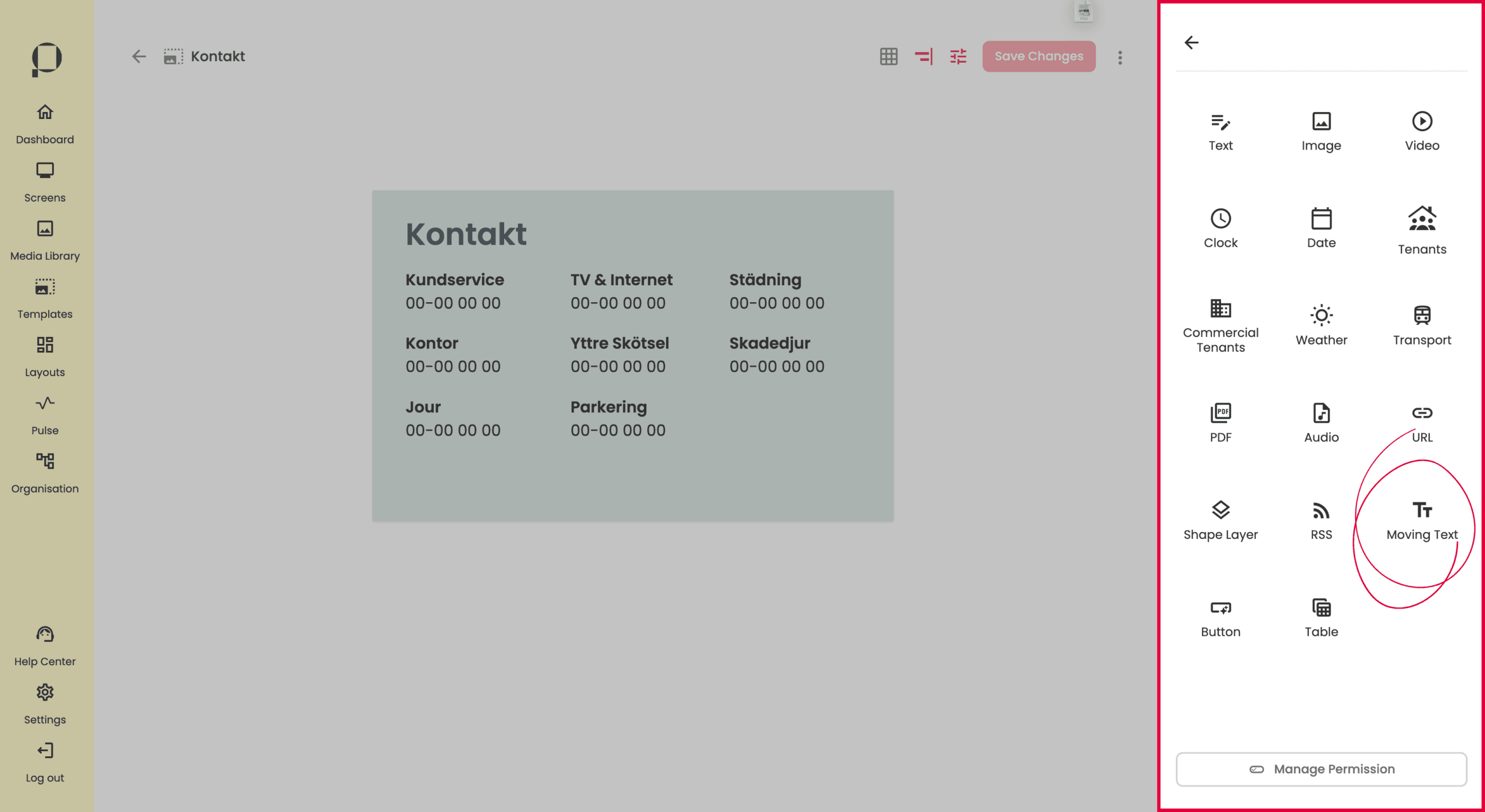
Widgets
Widgets är en central del av att arbeta med Templates. I detta avsnitt går vi igenom varje widget i detalj, innebörd och funktionalitet.
För att addera widgets till en template behöver du befinna dig i redigeringsvyn.
Text
Klicka på “Text.
Greppa widgeten genom att klicka på den.
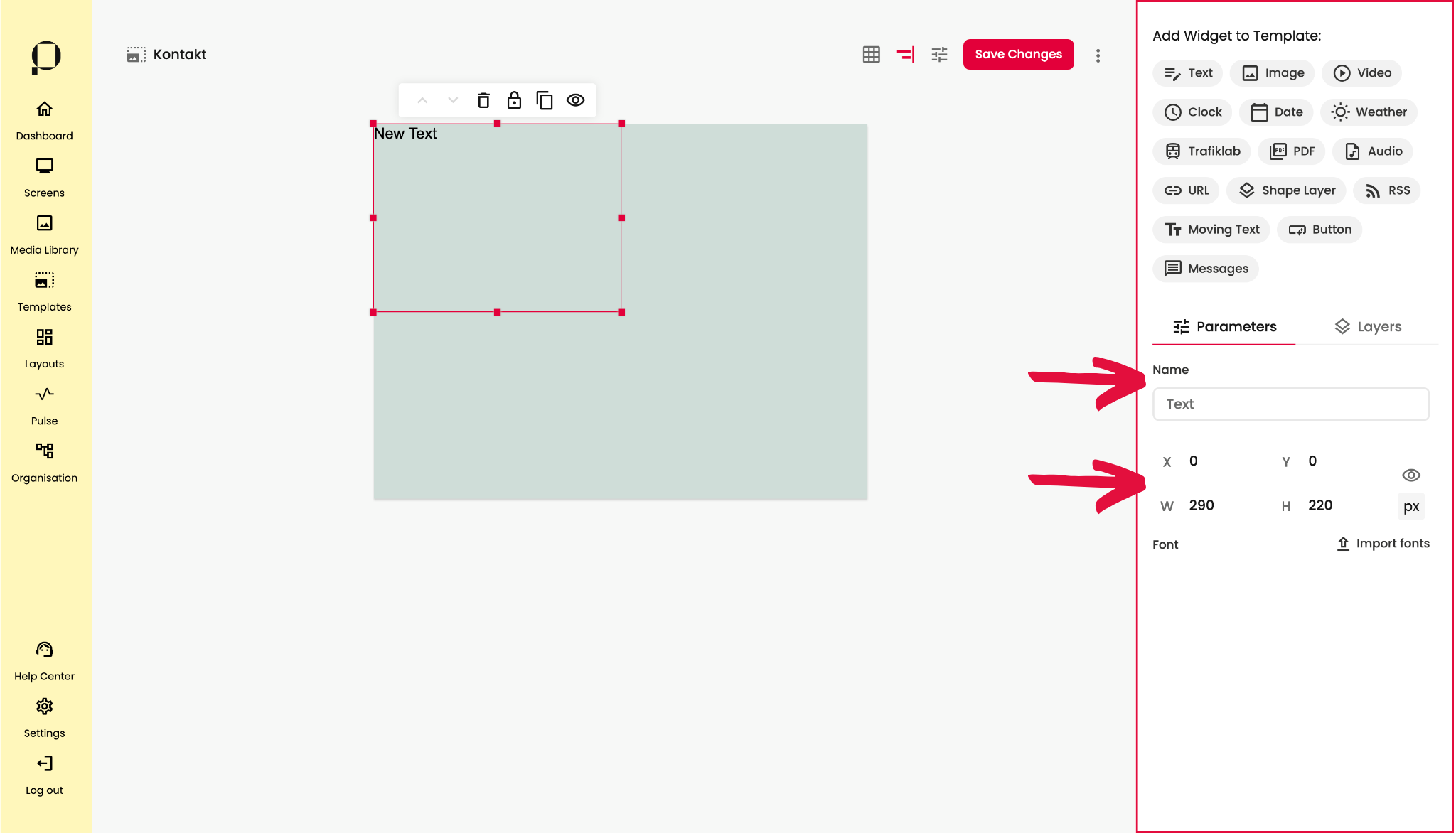
Använd sidopanelen till höger på skärmen för att redigera widgetens parametrar.
Ändra namn på widgeten genom att skriva ett nytt namn i inmatningsfältet under ”Namn”.
Ändra widgetens position i templaten genom att klicka på textfältet, hålla nere klicket för att dra och släppa det på önskad plats, eller genom att skriva direkt i inmatningsfälten för X/Y-koordinater.
Ändra textfältets storlek genom att klicka på texten och sedan hålla nere klicket på någon av de röda fyrkanterna för att justera storleken med musen, eller genom att skriva direkt i fälten för W/H.
💡 Du har också möjlighet att importera egna typsnitt i den högra sidopanelen genom att klicka på ”Import fonts”.
Ladda sedan upp ditt typsnitt i pop up-fönstret.
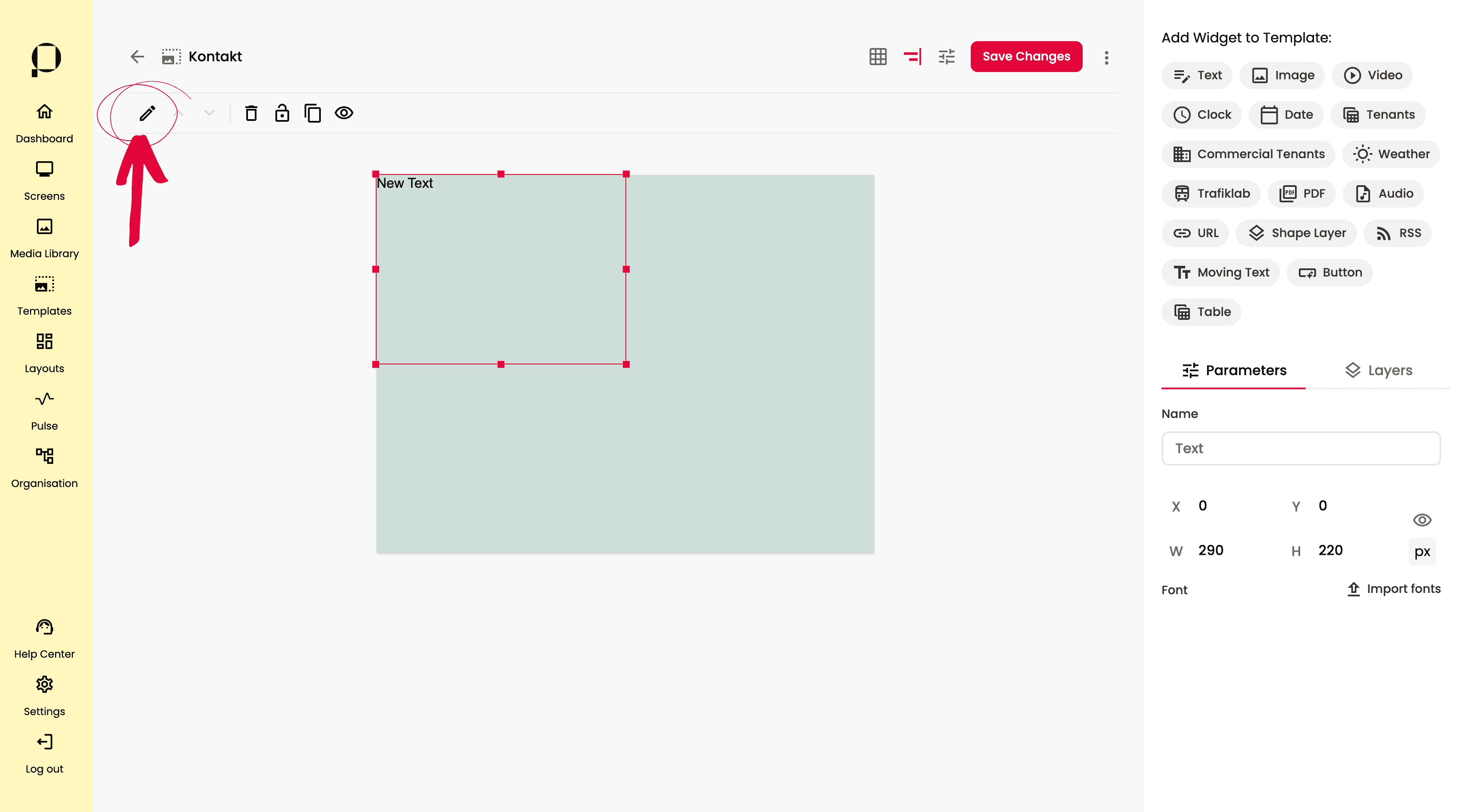
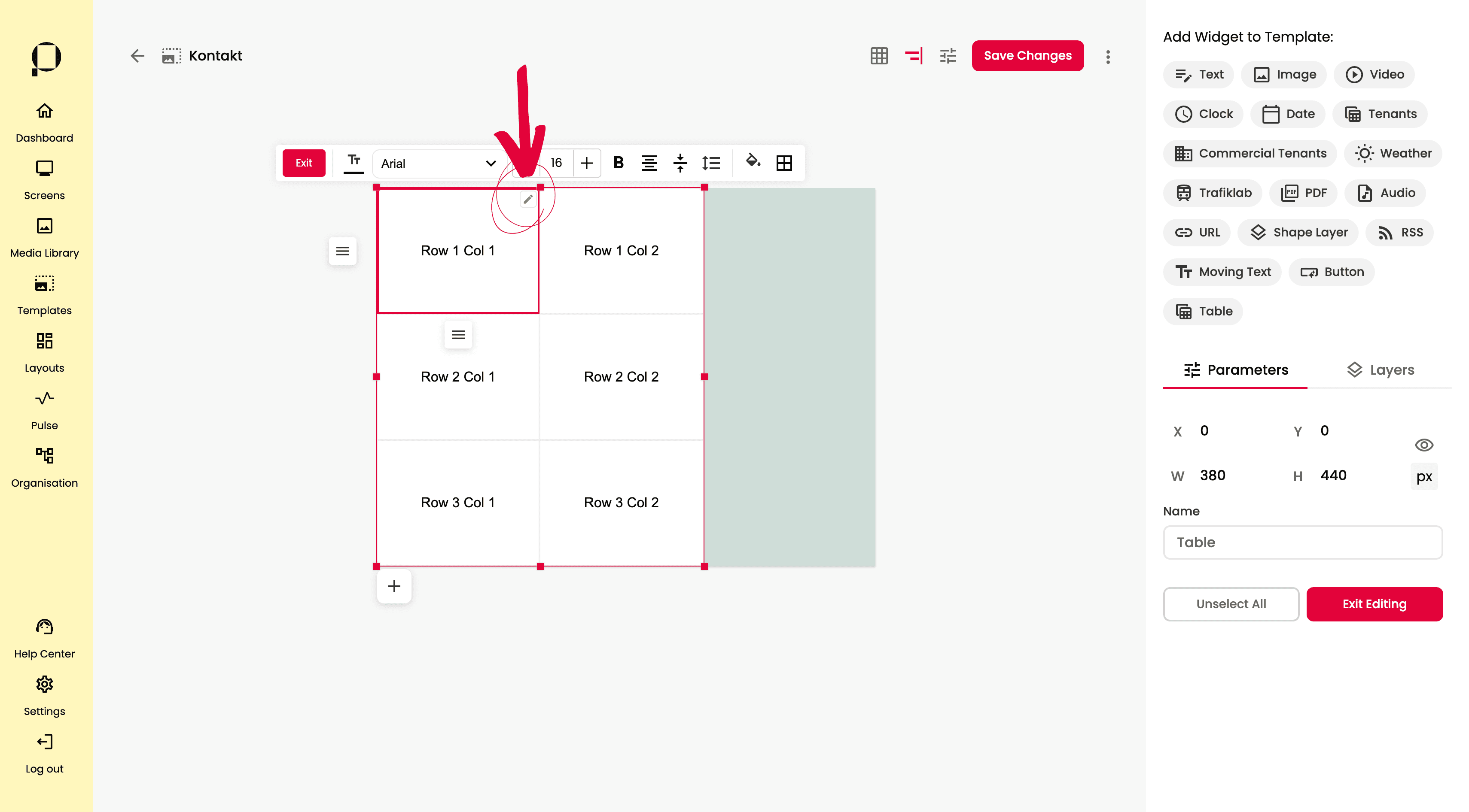
Klicka på pennan i verktygsraden eller dubbelklicka på textfältet i din template för att redigera innehållet och formatera texten.
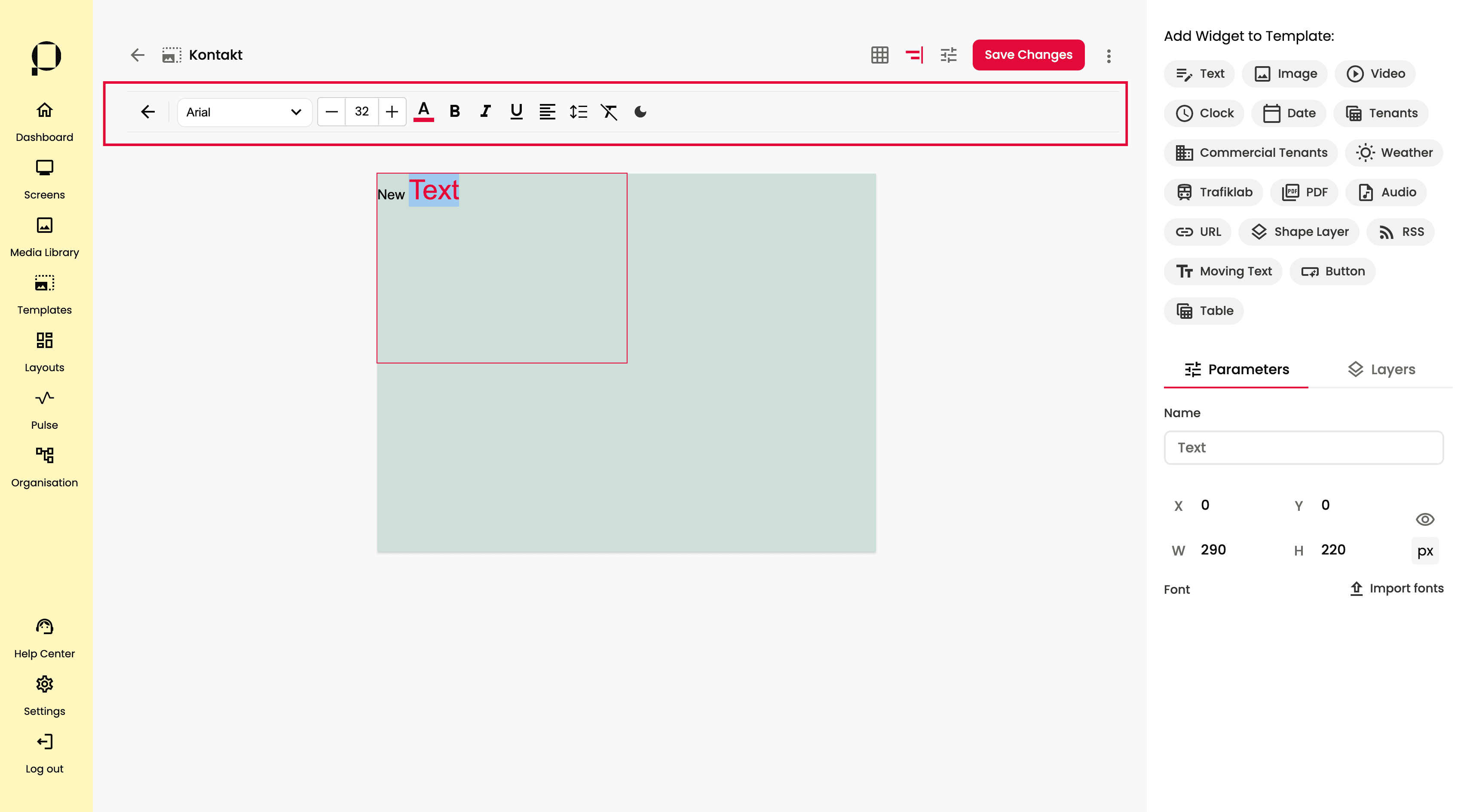
En verktygsrad visas då högst upp i textfältet, med flera alternativ för att justera textformatet. Vi går igenom funktionaliteten i följande stycken.
Textredigeraren är en ”WYSIWYG”-editor, vilket betyder att det du ser är det du får. Det fungerar som de flesta välkända textredigeringsverktyg, som Microsoft Word eller Google Docs.
Välj önskat typsnitt i verktygsfältet ovanför textfältet genom att använda rullgardinsmenyn för typsnitt. Dina importerade typsnitt och din organisations Brand Fonts kommer också att finnas tillgängligt i listan.
💡 Du som är Local Admin i din organisation kan sätta upp specifika brand typsnitt och färger för din organisation i Organisationsfliken, navigera dit via den gula sidopanelen till vänster på skärmen.
Justera storlek på texten med plus- och minusknapparna.
💡 Observera att du måste markera texten i fältet för att ändringen ska gälla, precis som i Word eller Docs.
Ändra färg på texten genom att klicka på färgväljaren och välja önskad färg, eller genom att skriva in HEX- eller RGBA-koden.
Justera styling genom att klicka på symbolerna för fetstil, kursiv eller understruken text. Symbolen blir röd när egenskapen är aktiv.
Styr textjusteringen genom att klicka på justeringssymbolen och välja ett av de tre alternativen: vänsterjusterad, centrerad eller högerjusterad.
Klicka på symbolen för radavstånd för att justera både bokstavsavstånd och radavstånd. Radavstånd avser det vertikala utrymmet mellan textrader, medan bokstavsavstånd styr det horisontella utrymmet mellan bokstäverna.
Symbolen med ett överkryssat T rensar formateringen i textfältet och återställer standardtypsnitt, storlek och färg för texten.
Symbolen med en måne lägger till en mörkare bakgrund i textfältet under redigeringsläget. Effekten försvinner när fältet inte längre är valt. Syftet är att öka synligheten och användarvänligheten, särskilt om bakgrunden är väldigt ljus eller detaljerad.
❗️Glöm inte att klicka på den röda knappen “Save Changes” för att bekräfta alla ändringar du gjort i din template.
Media
Media är widgeten som låter dig använda bilder, videos, ljudfiler och pdf:er i dina templates.
Klicka på “Media” i sektionen för widgets, högst upp till höger på skärmen.
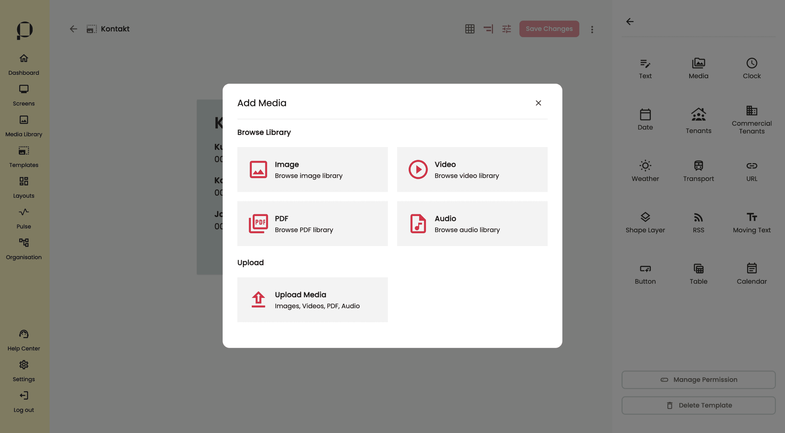
För att addera en mediefil som du redan har i ditt biblotek i PicFlow, klicka på någon av knapparna under “Browse Library“.
Klicka på “Image” för att addera en bild, “Video” för att addera en videofil, “Audio” för att addera en ljudfil eller “PDF” för att addera en pdf.
Vill du istället ladda upp filer från daton väljer du “Upload Media“.
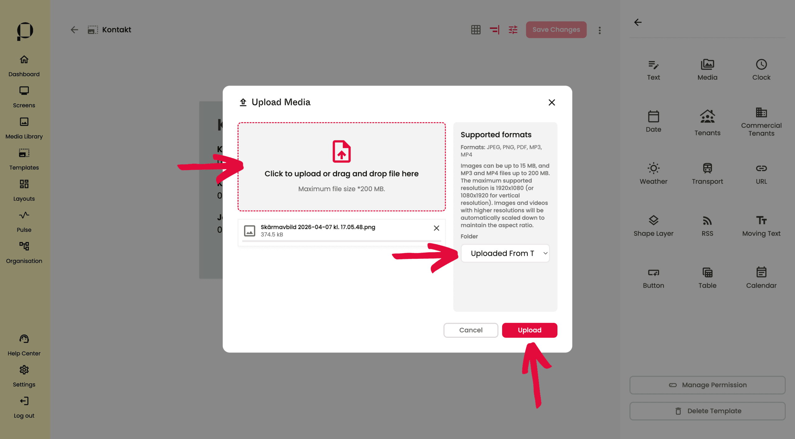
För att välja filer att ladda upp, klicka på det övre gråfältet i den pop up som öppnas. Du kan även dra in filer direkt in i rutan.
När du valt ut de filer du vill ladda upp kan du välja vilken grupp i ditt Media Library som du vill att filen ska sparas i (valfritt). För att ladda upp trycker du på den röda “Upload” knappen.

En Media-widget dyker upp i det övre vänstra hörnet av din template. I detta exempel har vi valt att ladda upp en bild.
För inställningar för de respektive medietyperna, se nedan.
➡️ Direktlänk till “Image” instruktion
➡️ Direktlänk till “Video” instruktion
Image
💡 Image är en del av widgeten “Media“. För att läsa om hur man lägger till en Media-widget i en template, klicka här.

Greppa widgeten genom att klicka på den.
Använd sidopanelen till höger på skärmen för att ändra lagrets parametrar.
Bildens namn visas i inmatningsfältet under “Name” och kan inte ändras.
Ändra bildens position i din template genom att klicka på bilden, dra den med muspekaren och släppa den på önskad plats, eller genom att skriva in önskad position direkt i X/Y-koordinatfälten.
Ändra bildens storlek genom att dra i någon av de röda fyrkanterna runt om widgeten, eller genom att ange önskad bredd och höjd direkt i W/H-fälten.
Du kan byta ut din bild mot en annan genom att klicka på knappen Replace Image. När du har valt din nya bild, klicka på den röda knappen “Save” för att bekräfta.

Välj hur din bild ska visas under Display Mode. Du har följande alternativ att välja på:
Original
Visar bilden i originalstorlek och format, utan justeringar. Om bilden är större än behållaren kan delar beskäras. Om den är mindre kan tomrum uppstå runt bilden.
Contain
Skalar bilden så att hela bilden får plats inom behållaren. Hela bilden syns, men det kan uppstå tomrum om bildens proportioner inte matchar behållaren.
Fill
Skalar bilden för att fylla hela behållaren. Inget tomrum visas, men bilden kan bli utdragen eller förvrängd om proportionerna skiljer sig mycket från behållarens.
Fit
Skalar bilden så att den passar inom behållaren och behåller sina ursprungliga proportioner. Om behållaren är mindre än bilden, beskärs delar för att undvika att ändra proportionerna.
Ändra värdet för bildens opacitet om du vill. 100 är helt solid och 0 är helt genomskinlig.
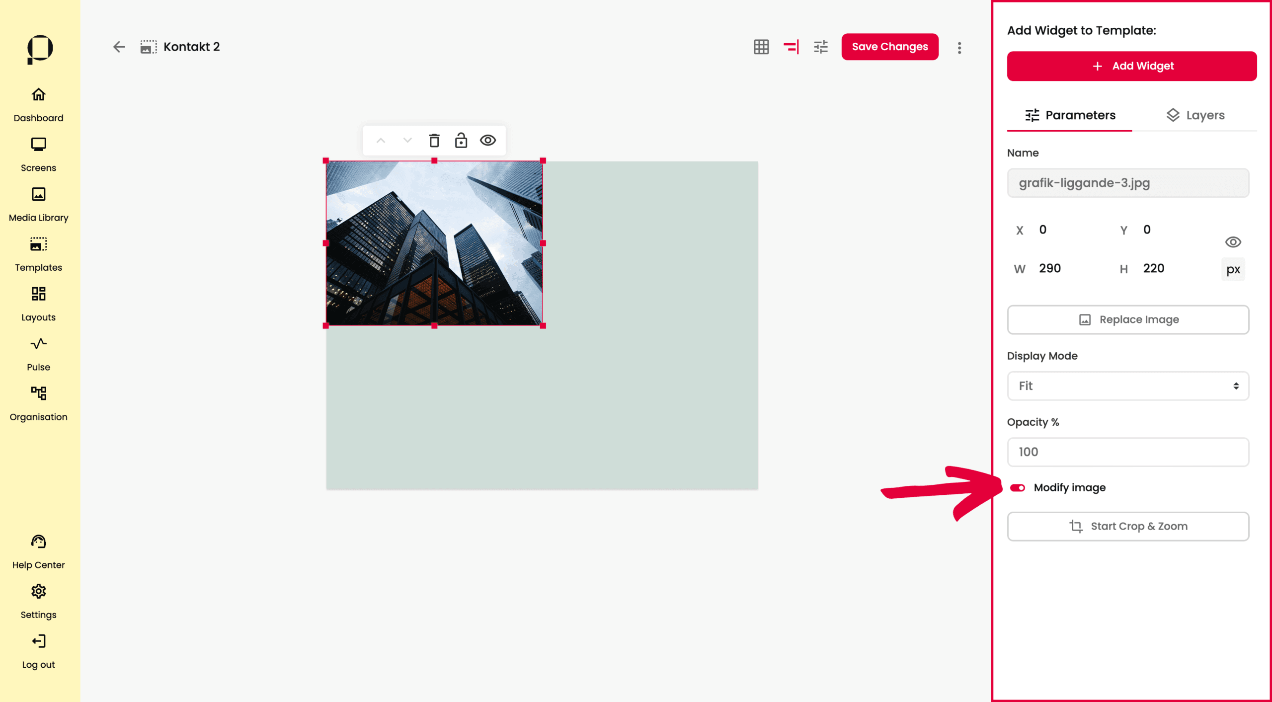
För att justera bildens innehåll, klicka på Modify Image och klicka sedan på knappen Start Crop & Zoom.
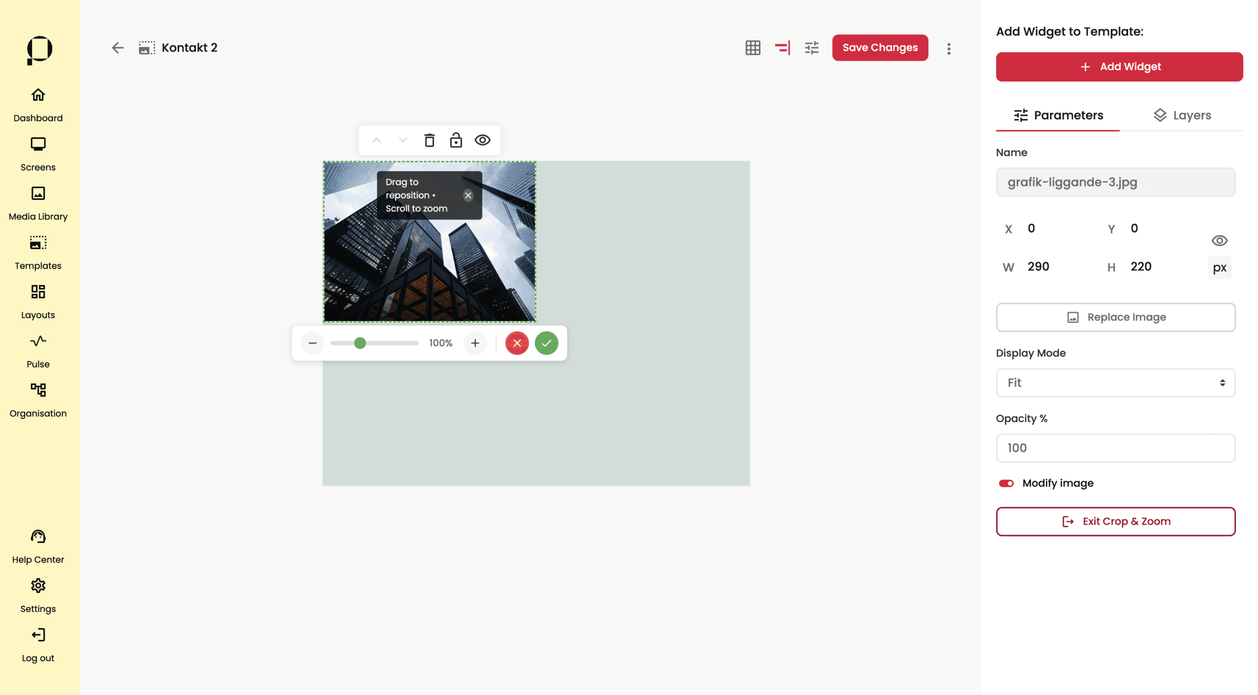
Använd reglaget som dyker upp i editorn för att zooma in respektive ut på bilden i widgeten området. Dra bilen med muspekaren inuti widget ytan för att positionera bildens innehåll.
För att gå ut ut Crop & Zoom-läge, klicka på knappen Exit Crop & Zoom i sidomenyn.
❗️Glöm inte att klicka på den röda knappen “Save Changes” för att bekräfta alla ändringar du gjort i din template.
Video
💡 Video är en del av widgeten “Media“. För att läsa om hur man lägger till en Media-widget i en template, klicka här.

Greppa widgeten genom att klicka på den. Ändra videons position i din template genom att klicka på videon, dra den med muspekaren och släppa den på önskad plats, eller genom att skriva in önskad position direkt i X/Y-koordinatfälten.
Ändra videons storlek sett till ytan genom att dra i någon av de röda fyrkanterna runt om widgeten, eller genom att ange önskad bredd och höjd direkt i W/H-fälten.
Du kan byta ut din video mot en annan genom att klicka på knappen “Replace Video“. När du har valt din nya bild, klicka på den röda knappen “Save” för att bekräfta.
Välj hur din bild ska visas under Display Mode. Du har följande alternativ att välja på:
Original
Visar videon i originalstorlek och format, utan justeringar. Om videon är större än behållaren kan delar beskäras. Om den är mindre kan tomrum uppstå runt videon.
Contain
Skalar videon så att hela bilden får plats inom behållaren. Hela videon syns, men det kan uppstå tomrum om bildens proportioner inte matchar behållaren.
Fill
Skalar videon för att fylla hela behållaren. Inget tomrum visas, men videon kan bli utdragen eller förvrängd om proportionerna skiljer sig mycket från behållarens.
Fit
Anpassar videon så att den passar behållaren. Om behållaren är mindre än videon, beskärs delar för att undvika att ändra proportionerna.
❗️Glöm inte att klicka på den röda knappen “Save Changes” för att bekräfta alla ändringar du gjort i din template.
💡 PDF är en del av widgeten “Media“. För att läsa om hur man lägger till en Media-widget i en template, klicka här.

Greppa widgeten genom att klicka på den. Använd sidopanelen till höger på skärmen för att ändra lagrets parametrar.
Ändra PDF:ens position i din template genom att klicka på videon, dra den med muspekaren och släppa den på önskad plats, eller genom att skriva in önskad position direkt i X/Y-koordinatfälten.
Ändra PDF:ens storlek sett till ytan genom att dra i någon av de röda fyrkanterna runt om widgeten, eller genom att ange önskad bredd och höjd direkt i W/H-fälten.

Under “Duration” visningstid för respektive sida i PDF:en.
Välj hur din PDF ska visas under “Display Mode“. Du har följande alternativ att välja på:
Original
Visar PDF:en i originalstorlek och format, utan justeringar. Om PDF:en är större än behållaren kan delar beskäras. Om den är mindre kan tomrum uppstå runt videon.
Contain
Skalar PDF:en så att hela bilden får plats inom behållaren. Hela videon syns, men det kan uppstå tomrum om bildens proportioner inte matchar behållaren.
Fill
Skalar PDF:en för att fylla hela behållaren. Inget tomrum visas, men videon kan bli utdragen eller förvrängd om proportionerna skiljer sig mycket från behållarens.
Fit
Anpassar PDF:en så att den passar behållaren. Om behållaren är mindre än PDF:en, beskärs delar för att undvika att ändra proportionerna.

Du kan byta ut din PDF mot en annan genom att klicka på knappen “Replace File“. När du har valt din nya bild, klicka på den röda knappen “Save” för att bekräfta.
❗️ Glöm inte att klicka på den röda knappen “Save Changes” för att bekräfta alla ändringar du gjort i din template.
Audio
💡 Audio är en del av widgeten “Media“. För att läsa om hur man lägger till en Media-widget i en template, klicka här.

Greppa widgeten genom att klicka på den.
Obs❗️ Ljudfilen kommer att visas som en grå rektangel i din mall. På den faktiska skärmen kommer den endast att visas som en smal mediespelare.
Om du inte vill ha någon visuell indikation på att ljud spelas upp på den faktiska skärmen, använd ikonen med ett öga i verktygsfältet längst upp på widgeten för att dölja den. Ett överkryssat öga betyder att ljudfilen ligger dold. Ljudet kommer fortfarande att spelas upp, men det kommer inte att finnas någon synlig representation av det på skärmen.

Använd sidopanelen till höger på skärmen för att ändra lagrets parametrar.
Ljudfilens namn visas i inmatningsfältet under “Name” och kan inte ändras.
Ändra ljudfilens position i din template genom att klicka på ljudfilen, dra den med muspekaren och släppa den på önskad plats, eller genom att skriva in önskad position direkt i X/Y-koordinatfälten.
Ändra ljudfilens storlek sett till ytan genom att dra i någon av de röda fyrkanterna runt om widgeten, eller genom att ange önskad bredd och höjd direkt i W/H-fälten.
Du kan byta ut din ljudfil mot en annan genom att klicka på knappen “Replace Audio“. När du har valt din nya bild, klicka på den röda knappen “Save” för att bekräfta.
Justera maxvolymen för ljudfilen med volymreglaget.
❗️ Glöm inte att klicka på den röda knappen “Save Changes” för att bekräfta alla ändringar du gjort i din template.
Clock
Klicka på ”Clock”.
Ett pop up-fönster visas på skärmen. Skapa din widget genom att ge den ett namn, välja mellan digital och analog klocka under “Clock Type“, och välja mellan 12 och 24 timmarsformat under “Time Format“. Avslutningsvis, väljs vilken tidszon klockan skall visa tiden för under “Timezone“.
Spara dina val genom att trycka på den röda “Create” knappen.

Din klockwidget kommer att visas i det övre vänstra hörnet av din template. Greppa widgeten genom att klicka på den.

Använd sidopanelen till höger på skärmen för att redigera widgetens parametrar.
Ändra widgetens position i din template genom att klicka på widgeten, dra den med muspekaren och släppa den på önskad plats, eller genom att skriva in önskad position direkt i X/Y-koordinatfälten.
Ändra widgetens storlek genom att dra i någon av de röda fyrkanterna runt om widgeten, eller genom att ange önskad bredd och höjd direkt i W/H-fälten.
Ändra namn på klockwidgeten genom att skriva ett nytt namn i inmatningsfältet under ”Widget Name”.

Du ges även möjlighet att ändra de inställningar i gjort för “Widget Type” och “Timezone“.

Under “Font“, välj typsnitt och textfärg. Välj den färg du vill ha i färgväljaren, eller genom att skriva in HEX- eller RGBA-koden.
Ändra bakgrundsfärg på klockwidgeten genom att klicka på färgväljaren och välja önskad färg, eller skriva in HEX- eller RGBA-koden. Du kan också ställa in opactiet i nästa fält med ett värde mellan 0 och 100, där 100 är helt solid och 0 är helt genomskinlig.
Ändra stolek på klockans siffror under “Numbers Size” genom att skriva in värdet i pixlar för teckenstorlek i inmatningsfältet.
Justera tidsformatet under “Time Format“, välj mellan 12 och 24 timmarsklocka.
❗️Glöm inte att klicka på den röda knappen “Save Changes” för att bekräfta alla ändringar du gjort i din template.
Date
Klicka på ”Date”.

Ett pop up-fönster visas på skärmen.
Skapa din widget genom att ge den ett namn under “Widget Name“.
Under “Widget Type” väljer vi mellan att visa dagens datum (välj “Today“) eller hela veckans datum i (välj “Week“).

Välj språk för widgeten i “Language“.
För Widget Type “Today”, ställ in visningsformat för datumet under “Date Format“.
Spara dina val genom att trycka på den röda “Create” knappen.

Din datum-widget kommer att visas i det övre vänstra hörnet av din template. Greppa widgeten genom att klicka på den.

Använd sidopanelen till höger på skärmen för att redigera widgetens parametrar.
Ändra widgetens position i din template genom att klicka på videon, dra den med muspekaren och släppa den på önskad plats, eller genom att skriva in önskad position direkt i X/Y-koordinatfälten.
Ändra widgetens storlek genom att dra i någon av de röda fyrkanterna runt om widgeten, eller genom att ange önskad bredd och höjd direkt i W/H-fälten.

Ändra namn på klockwidgeten genom att skriva ett nytt namn i inmatningsfältet under ”Widget Name” i sidopanelen till höger.
Du ges även möjlighet att ändra de inställningar i gjort för “Widget Type” och “Language“.
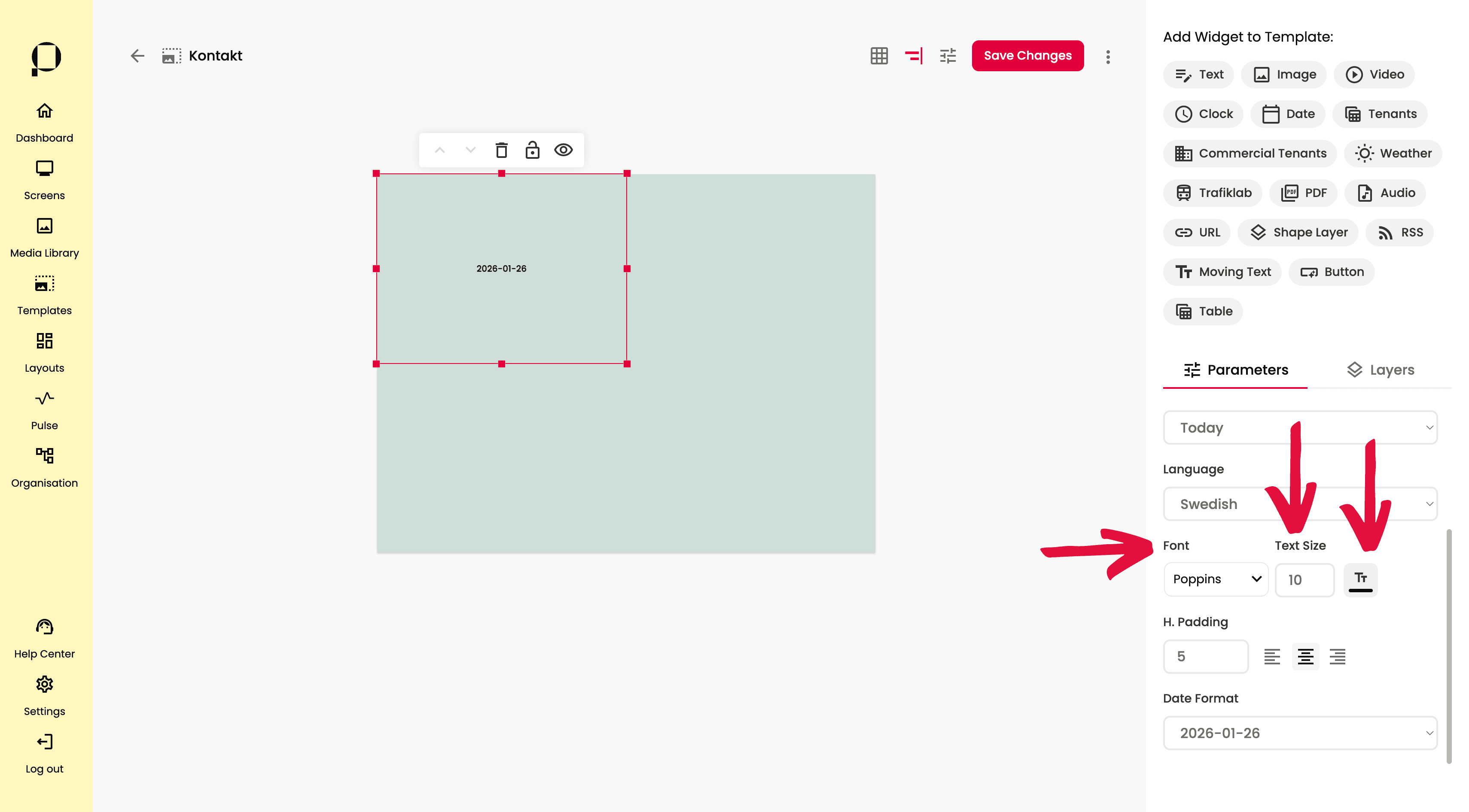
Under “Font“, välj typsnitt, textstorlek och textfärg. Välj den färg du vill ha i färgväljaren, eller genom att skriva in HEX- eller RGBA-koden.
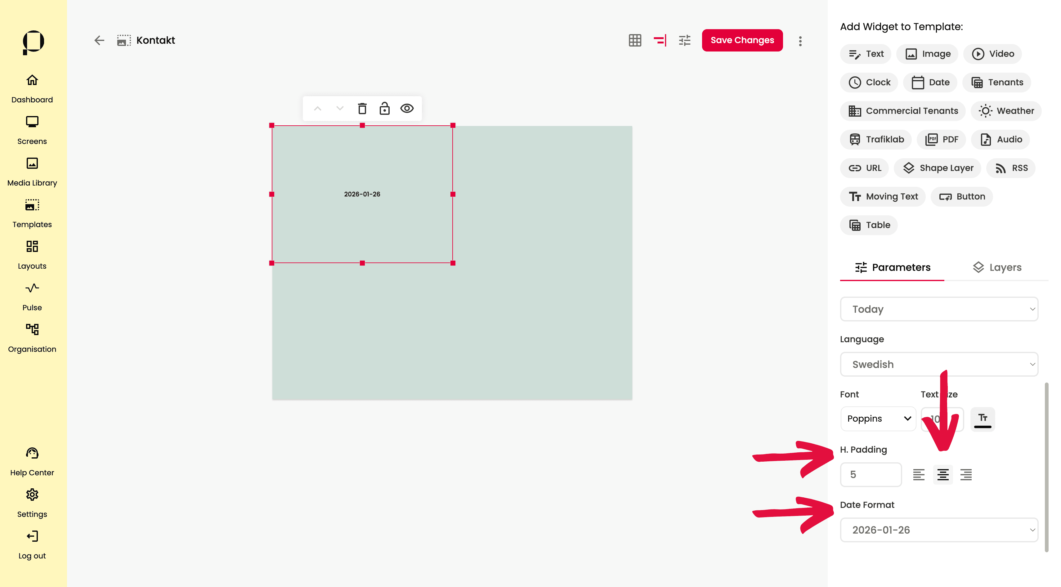
Styr i vilken kant av widgeten som datumet ska vara justerat, välj mellan vänsterjusterat, centrerat och högerjusterat. Du kan även justera hur stort avstånd du vill ha till kant i widgeten, under H. Padding (horisontell padding).
💡 Horisontell padding fyller endast funktion om datumet är vänster-, eller högerjusterat.
Justera formatet på hur datumet visas under “Date Format“, välj det format du föredrar eller prova dig fram mellan alternativen i listan.
❗️ Glöm inte att klicka på den röda knappen “Save Changes” för att bekräfta alla ändringar du gjort i din template.
Weather
Klicka på ”Weather”.

Ett pop up-fönster visas på skärmen. Skapa din widget genom att ge den ett namn, välja mellan Current Weather, Hourly Forecast och Daily Forecast under “Display Type“.
Current Weather: Vädret just nu.
Hourly Forecast: Vädret kommande timmar.
Daily Forecast: Vädret kommande dagar.
Avslutningsvis, sök på den plats du vill visa vädret för, under “Location“.
Spara dina val genom att trycka på den röda “Create” knappen.
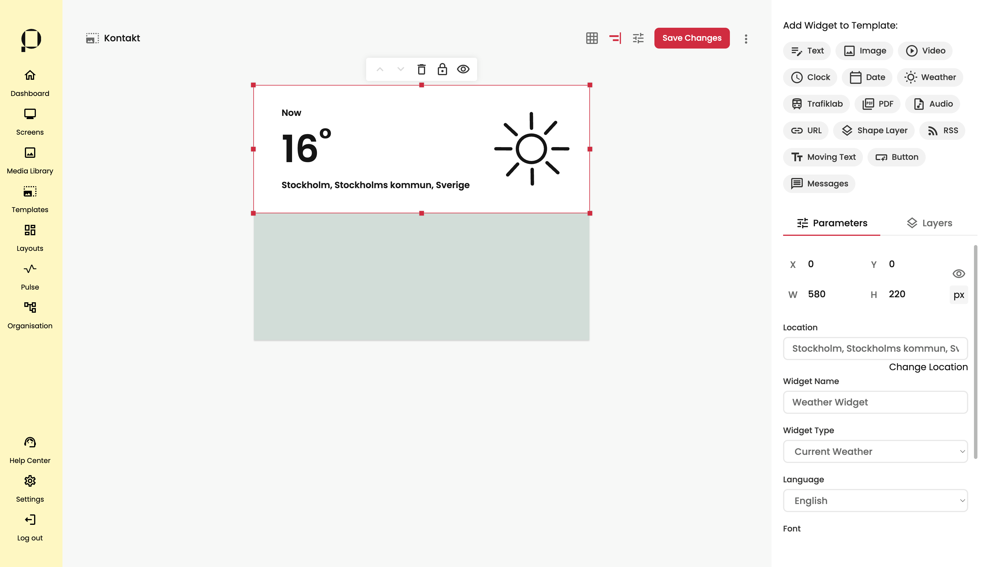
Din väderwidget kommer att visas i det övre vänstra hörnet av din template. Greppa widgeten genom att klicka på den.
 Använd sidopanelen till höger på skärmen för att redigera widgetens parametrar.
Ändra widgetens position i din template genom att klicka på widgeten, dra den med muspekaren och släppa den på önskad plats, eller genom att skriva in önskad position direkt i X/Y-koordinatfälten.
Ändra widgetens storlek genom att dra i någon av de röda fyrkanterna runt om widgeten, eller genom att ange önskad bredd och höjd direkt i W/H-fälten.

Du kan justera de val du ställde in när du skapade din widget. Byt plats för väderprognosen i fältet för “Location“, genom att trycka på “Change Location” strax under inmatningsfältet. Vid tryck öppnas sökfältet där du kan söka efter din önskade plats.
Ändra namn på väderwidgeten genom att skriva ett nytt namn i inmatningsfältet under ”Widget Name” i sidopanelen till höger.
Byt språk under “Language“.

Under “Font“, välj typsnitt och textfärg. Välj den färg du vill ha i färgväljaren, eller genom att skriva in HEX- eller RGBA-koden.
Ändra bakgrundsfärg på väder widgeten genom att klicka på färgväljaren och välja önskad färg, eller skriva in HEX- eller RGBA-koden. Du kan också ställa in opactiet i nästa fält med ett värde mellan 0 och 100.
Klicka på sol-symbolen och ställ in färg på väderikonerna i widgeten.

Välj vilken enhet du vill ha för temperatur under “Temperature“.
Du kan även toggla av visning av plats i widgeten, under “Show Location“.
❗️ Glöm inte att klicka på den röda knappen “Save Changes” för att bekräfta alla ändringar du gjort i din template.
Transport
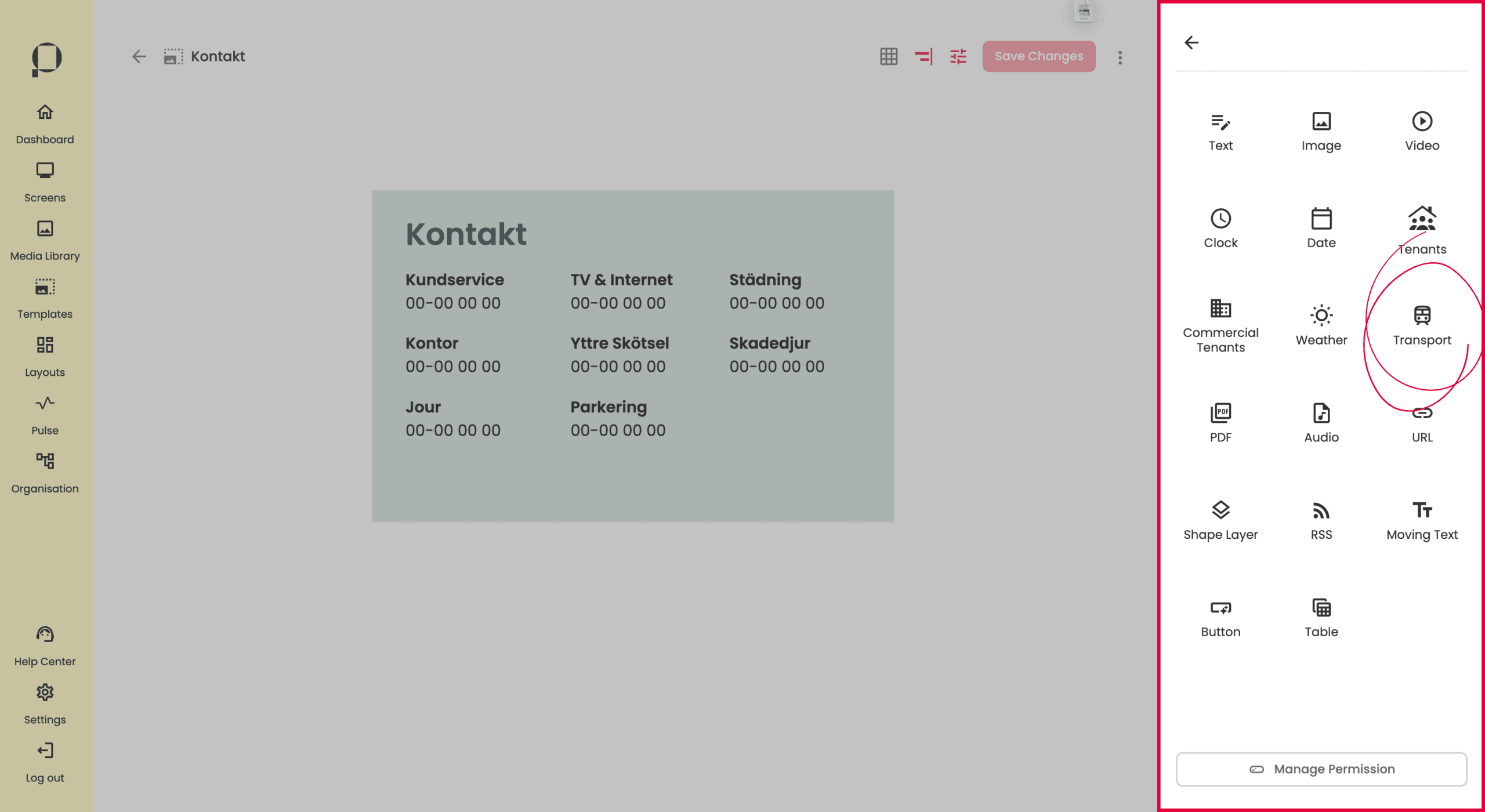
Klicka på ”Transport” uppe till höger på skärmen.

Ett pop up-fönster visas på skärmen. Skapa din widget genom att ge den ett namn, och söka efter ett stop i inmatningsfältet för “Stop Name“.
💡 Textfältet för “Stop Name” fungerar som ett sökfält. Skriv din söktext och välj bland alternativen i listan.
Spara dina val genom att trycka på den röda “Accept” knappen.

Din widget kommer att visas i det övre vänstra hörnet av din template. Greppa widgeten genom att klicka på den.

Använd sidopanelen till höger på skärmen för att redigera widgetens parametrar.
Ändra widgetens position i din template genom att klicka på widgeten, dra den med muspekaren och släppa den på önskad plats, eller genom att skriva in önskad position direkt i X/Y-koordinatfälten.
Ändra widgetens storlek genom att dra i någon av de röda fyrkanterna runt om widgeten, eller genom att ange önskad bredd och höjd direkt i W/H-fälten.

Den valda hållplatsen visas i fältet under “Stop Name”. För att byta hållplats, klicka på “Change Stop” under det inaktiverade fältet. När du klickar där får du möjlighet att söka efter en ny hållplats på samma sätt som vid skapandet av Transport-widgeten.

Under “Play time” ställer du in för hur långt fram du vill visa avgångar. Standardvärdet är 30 minuter.
Detta innebär att maxtiden framåt som avgångar visas är 30 minuter.
💡 Tips! För hållplatser med få avgångar, är det alltså bättre att välja det längsta möjliga alternativet, för att visa fler avgångar.

Ändra språk som används i Transport-widgeten under “Language”.

Under “Hide Departures” kan du dölja avgångar som sker inom ett visst tidsintervall. Standardvärdet är 1 minut, men detta kan justeras med pilarna, eller genom att skriva direkt i fältet.
Välj vilka typer av transporter du vill visa genom att toggla av eller på de olika transportmedlen.

Under “Line Box” kan du justera bakgrundsfärg och textfärg för varje avgångs lilla visningsruta.

För widgetens rubrik kan du ändra typsnitt, textfärg och textstorlek under “Title“.

Samma justeringar, typsnitt, textfärg och textstorlek, kan göra för texten för varje stopp, under “Content“.

Du kan även anpassa bakgrundsfärgerna i widgeten under “Departures Background“. För avgångslistan finns separata färger för jämna och udda rader. Du kan också ändra bakgrundsfärg för hela widgeten under “Background“.
❗️ Glöm inte att klicka på den röda knappen “Save Changes” för att bekräfta alla ändringar du gjort i din template.
URL
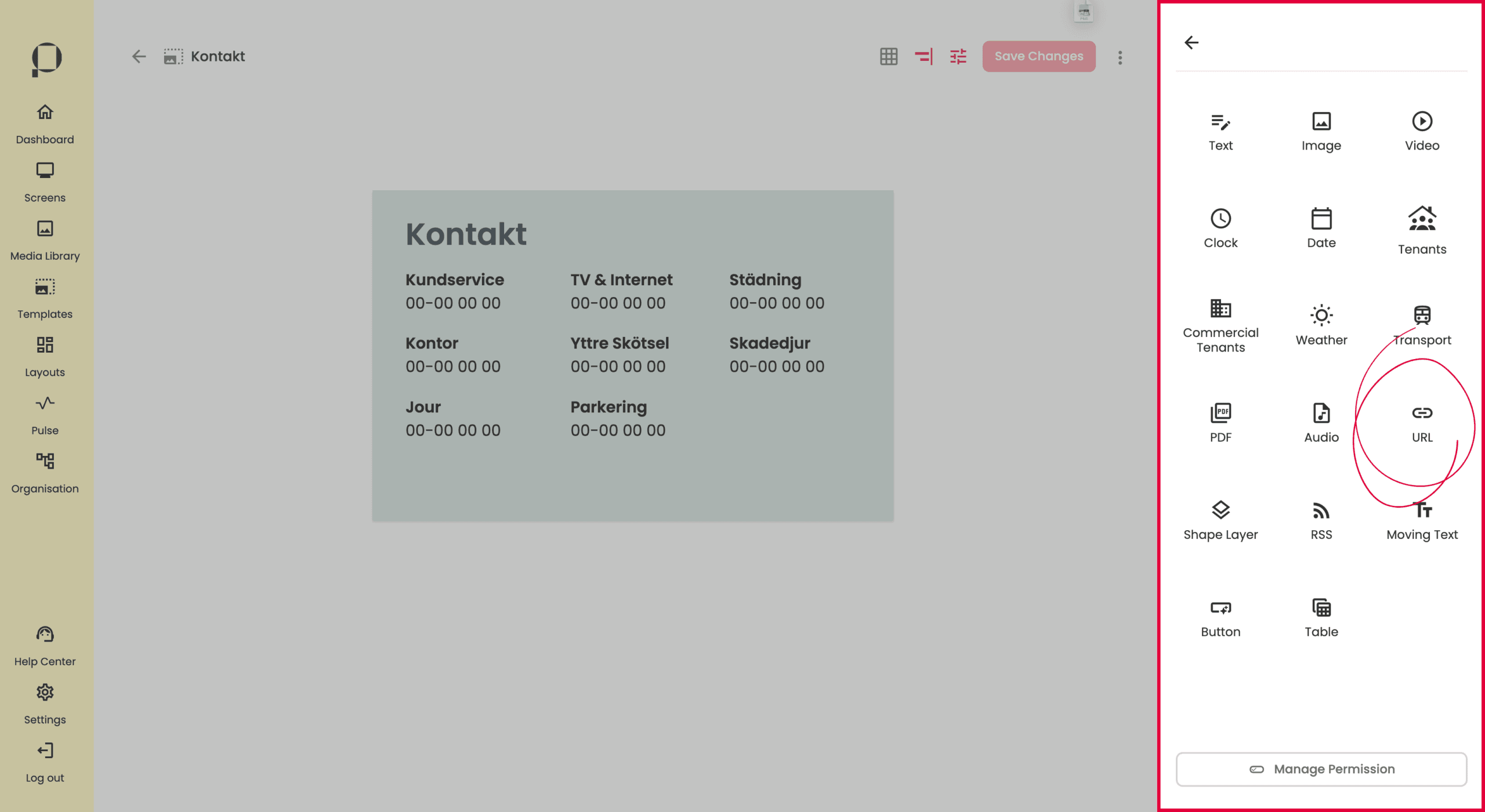 Klicka på ”URL”.

Ett pop up-fönster visas på skärmen. Skapa din widget genom att ge den ett namn, och ange en URL under “URL” som du vill visa upp på skärmen.
Under “Refresh Time“, ange även ett tidsintervall för hur ofta länken ska uppdateras. Standard är 24 timmar.
Spara dina val och skapa din widget genom att trycka på den röda “Create” knappen.

Ändra widgetens position i din template genom att klicka på ljudfilen, dra den med muspekaren och släppa den på önskad plats, eller genom att skriva in önskad position direkt i X/Y-koordinatfälten.
Ändra widgetens storlek sett till ytan genom att dra i någon av de röda fyrkanterna runt om widgeten, eller genom att ange önskad bredd och höjd direkt i W/H-fälten.

Widgetens namn går att ändra i inmatningsfältet under “Name“.
URL-adressen går att ändra under “URL“.
Du kan toggla av eller på uppdatering av din länk. Justera tidsintervallet genom att skriva siffror i inmatningsfältet, och välja enhet i listan.

Använd zoomreglaget under “Zoom” för att zooma in eller ut på ditt länkinnehåll. I det här exmplet har vi zoomar ut ill 47% för att visa mycket av sidan i behållaren.
💡 På små templates, visas en del webbsidor i mobilversion på grund av sidans inställda responsivitet.
Använd zoomreglaget för att zooma ut och få webbversionen av sidan, om så önskas.
Välj en bakgrundsfärg för din widget i färgväljaren, du kan även justera opacitet.
💡 Bakgrundsfärgen syns om din webbsida inte skulle kunna visa något. T.ex vid nätverksfel.
Glöm inte att klicka på den röda knappen “Save Changes” för att bekräfta alla ändringar du gjort i din template.
Shape Layer
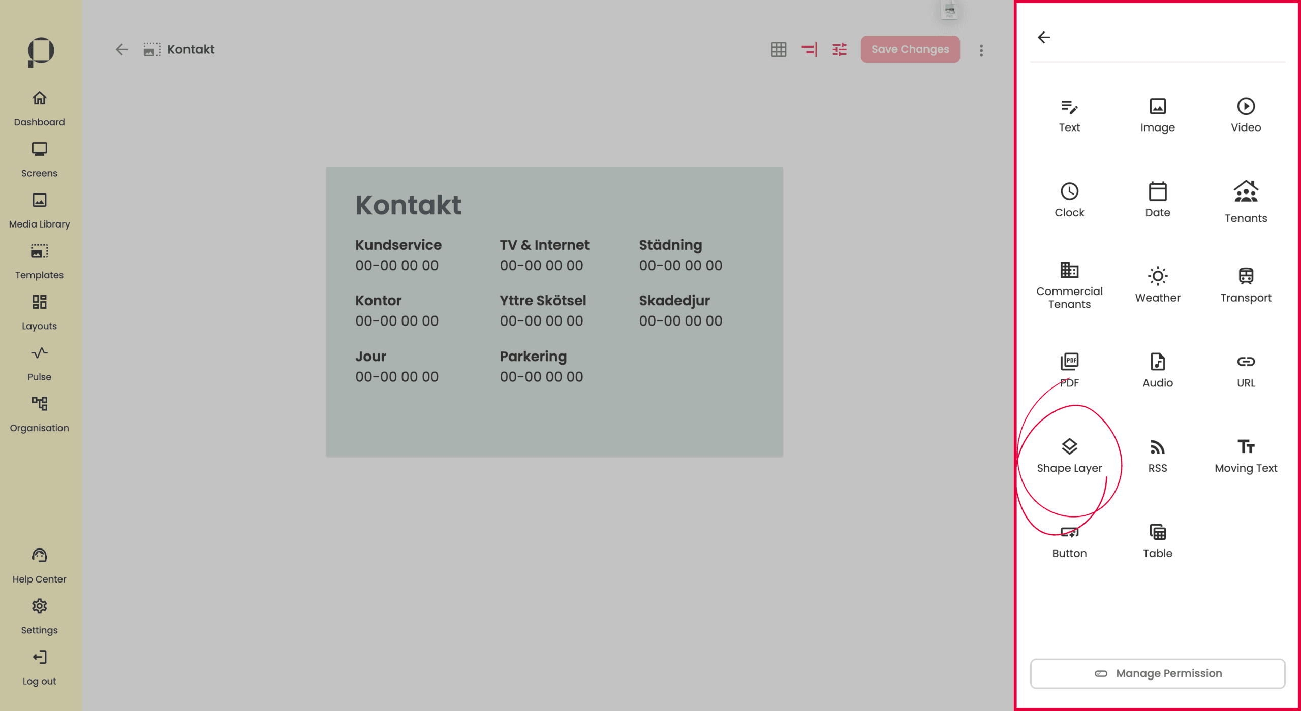
Klicka på “Shape Layer“.

Greppa widgeten genom att klicka på den. Använd sidopanelen till höger på skärmen för att ändra lagrets parametrar.

Ändra Shape layer-widgetens position i template:en genom att klicka på lagret och hålla inne klicket för att dra och släppa det till önskad plats, eller genom att skriva direkt i X/Y-koordinatfälten i sidopanelen till höger på skärmen.
Ändra Shape layer-widgetens storlek genom att dra i någon av de röda fyrkanterna runt omkring widgeten, eller genom att ange önskad bredd och höjd direkt i W/H-fälten.
Ändra Shape layer-widgetens namn genom att skriva ett nytt namn i inmatningsfältet under “Name“.
Ändra bakgrundsfärg under “Background” genom att klicka på färgväljaren och välja önskad färg, eller genom att skriva in färgens HEX- eller RGB-kod. Du kan även lägga till opacitet i nästa fält med värden från 0 till 100, där 0 är helt genomskinligt och 100 är helt täckande.
❗️Glöm inte att klicka på den röda knappen “Save Changes” för att bekräfta alla ändringar du gjort i din template.
RSS
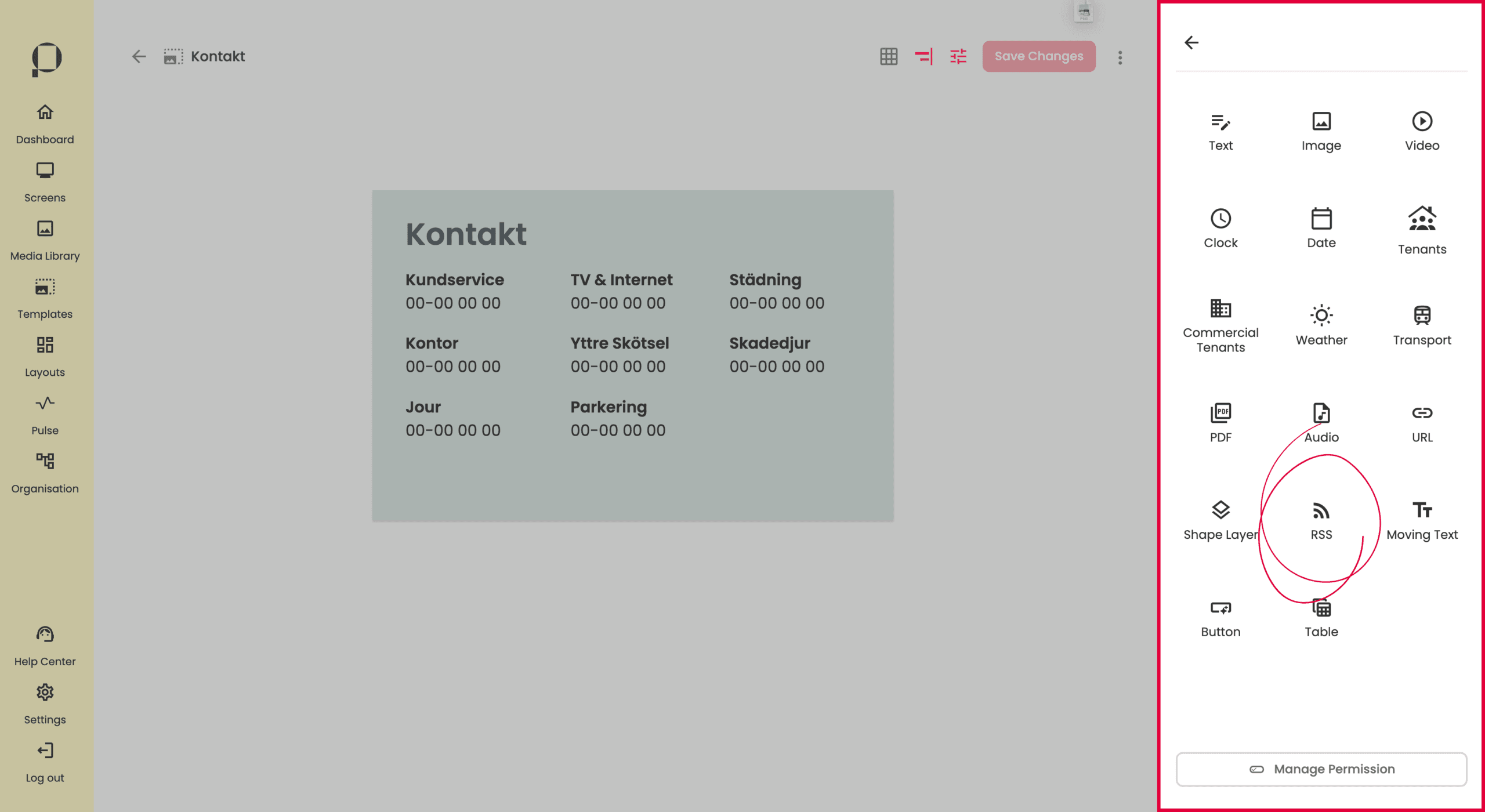
Klicka på ”RSS” uppe till höger på skärmen.

Ett pop up-fönster visas på skärmen. Skapa din widget genom att ge den ett namn, och ange en URL under ” RSS Feed URL” som du vill visa upp på skärmen. Under “Theme” kan du välja en ljus eller mörk bakgrundsfärg för din widget.
Spara dina val och skapa din widget genom att trycka på den röda “Create” knappen.

Ändra widgetens position i template:en genom att klicka på widgeten och hålla inne klicket för att dra och släppa det till önskad plats, eller genom att skriva direkt i X/Y-koordinatfälten.
Ändra widgetens storlek genom att dra i någon av de röda fyrkanterna runt omkring widgeten, eller genom att ange önskad bredd och höjd direkt i W/H-fälten.
Widgetens namn går att ändra i inmatningsfältet under “Name“.
URL-adressen går att ändra under “RSS Link“, genom att trycka på pennan. Tryck på bocken för att spara dina förändringar, eller krysset för att avbryta.

Välj hur länge varje inlägg ska visas under “Duration“. Justera titelns storlek under “Title“. I inmatningsfältet för “Spacing” justeras avstånd mellan textstyckena i widgeten, och under “Padding” justeras avståndet runt omkring.

Toggla av eller på visning av RSS-flödets namn under “Feed Name“. Justera feednamnets textstorlek under “Font Size“.
Toggla av eller på visning av RSS-flödets inläggstext under “Content“. Justera textens textstorlek under “Font Size” och ange antal tecken som max för inläggen.
💡 Efter sista ordet i inläggtexten läggs det på “…” om inlägget är längre än din angivna maxlängd.
Toggla av eller på visning av RSS-flödets inläggsbilder under “Feed Image“. Välj hur bilden ska visas under “Display Mode“.
📖 För att läsa mer om möjliga visningslägen, se avsnittet om widgeten “Image” i denna User Guide. Navigera dit genom att klicka här.
Justera hur mycket plats bilden tar upp i reglaget för “Image Width“.
❗️ Glöm inte att klicka på den röda knappen “Save Changes” för att bekräfta alla ändringar du gjort i din template.
Moving Text
Klicka på ”Moving Text” uppe till höger på skärmen.

Greppa widgeten genom att klicka på den. Använd sidopanelen till höger på skärmen för att ändra lagrets parametrar.

Widgetens namn går att ändra i inmatningsfältet under “Name“.
Ändra widgetens position i template:en genom att klicka på widgeten och hålla inne klicket för att dra och släppa det till önskad plats, eller genom att skriva direkt i X/Y-koordinatfälten.
Ändra widgetens storlek genom att dra i någon av de röda fyrkanterna runt omkring widgeten, eller genom att ange önskad bredd och höjd direkt i W/H-fälten.

Välj vilket typsnitt texten ska ha under “Font“.
💡 Du har också möjlighet att importera egna typsnitt i den högra sidopanelen genom att klicka på ”Import fonts” och ladda upp ditt typsnitt i pop up-fönstret.

Under rubriken “Content” har du möjlighet att välja färg på texten och bakgrunden. Klicka på färgrutan eller färgkoden för att öppna färgväljaren. Du kan också ställa in opactiet med ett värde mellan 0 och 100, där 100 är helt solid och 0 är helt genomskinlig.
❗️ Observera att bakgrundsfärgen som default är inställd på 0 opacitet.
För att din bakgrundsfärg ska synas behöver du öka värdet för opaciteten.
I fältet för padding ställer du in avstånd i pixlar från ovankant.
Justera textjusteringen genom att klicka på justeringssymbolen och välja ett av de tre alternativen: vänsterjusterad, centrerad eller högerjusterad.

I textfältet skriver du den text du vill att widgeten ska visa.
Under “Text Size” anger du textstorleken i pixlar.
Dra i reglaget under “Moving Text Speed” för att justera hur snabbt texten rör sig. Du kan se förändringen av hastigheten direkt i widgeten.
❗️ Glöm inte att klicka på den röda knappen “Save Changes” för att bekräfta alla ändringar du gjort i din template.
Button
Klicka på “Button” i sektionen för widgets, högst upp till höger på skärmen.

En Button-widget dyker upp i det övre vänstra hörnet av din template. Ett klick lägger till en Button-widget.

Ändra knappens position i din template genom att skriva direkt i fälten för X/Y-koordinater eller genom att klicka på knappen och hålla inne klicket för att dra och släppa den till önskad plats.
Ändra knappens storlek genom att klicka på knappen och dra i någon av de röda fyrkanterna runt om widgeten, eller genom att ange önskad bredd och höjd direkt i W/H-fälten.
Ändra widgetens namn genom att skriva ett nytt namn i inmatningsfältet under “Widget Name“.
Välj antingen Button eller Image som “Widget Type“. Om du väljer Image får du möjlighet att ladda upp en bild som knapp och ändra bildens visningsläge. De olika alternativen ger olika inställningar i menyn. Vi går igenom båda alternativen nedan.
Widget Type Button

Ändra knappens text med inmatningsfältet under “Button Caption“.
Du kan även ändra bakgrundsfärg och kantfärg genom att öppna färgväljarna för dem och välja önskad färg, eller genom att skriva in färgens HEX- eller RGBA-kod.
Välj önskat typsnitt för knappens text i rullistan Font. Ändra textstorlek, vikt och färg med alternativen nedanför. Det finns ett inmatningsfält för att ange textstorlek i pixlar, möjlighet att välja “Font Weight“, samt att ändra textfärg via färgväljaren eller genom att skriva in HEX- eller RGBA-kod.
Ge knappen rundade hörn med hjälp av reglaget “Corner Radius“.
Toggla av eller på kantlinjen genom att använda togglen för “Border“, och justera kantlinjens bredd med Border-reglaget.

Välj mellan Flat eller Embossed effekt beroende på vilket utseende du vill ge knappen, under “Effects“.
Toggla av eller på skugga för knappen med togglen för “Shadow“. Justera skuggans färg med färgväljaren, eller skriv in HEX- eller RGBA-kod. Du kan även lägga till opacitet i nästa fält, där 0 är helt genomskinligt och 100 är helt täckande. Lägg till oskärpa i skuggan med reglaget Blur.

Klicka på “Pop–up content” för att se vilka alternativ som kan öppnas med knappen. Du kan välja mellan Image, Video och URL.
Widget Type Image

Tryck på knappen “Select Content” för att välja bild.
Justera sedan hur bilden ska visas under “Picture display mode“.
📖 För att läsa mer om möjliga visningslägen, se avsnittet om widgeten “Image” i denna User Guide. Navigera dit genom att klicka här.

Klicka på “Pop–up content” för att se vilka alternativ som kan öppnas med knappen. Du kan välja mellan Image, Video och URL.
❗️ Glöm inte att klicka på den röda knappen “Save Changes” för att bekräfta alla ändringar du gjort i din template.
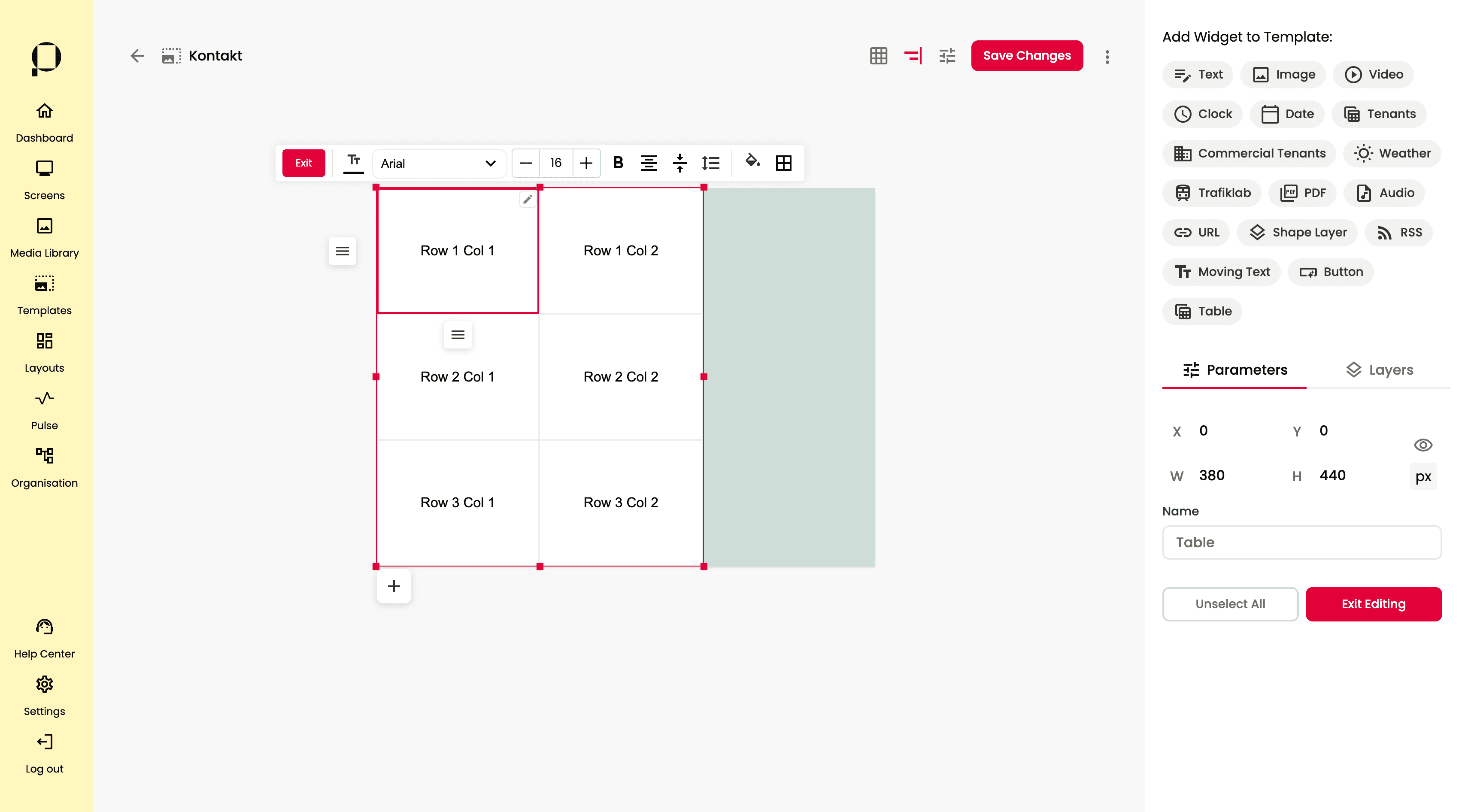
Table
Klicka på “Table” uppe till höger på skärmen.

Greppa widgeten genom att klicka på den.

Använd sidopanelen till höger på skärmen för att redigera widgetens parametrar.
Ändra widgetens position i templaten genom att klicka på widgeten, hålla nere klicket för att dra och släppa det på önskad plats, eller genom att skriva direkt i inmatningsfälten för X/Y-koordinater.
Ändra widgetens storlek genom att klicka på widgeten och sedan hålla nere klicket på någon av de röda fyrkanterna för att justera storleken med musen, eller genom att skriva direkt i fälten för W/H.
Under ”Name”, ändra namn på widgeten genom att skriva ett nytt namn i inmatningsfältet.

Dubbelklicka på widgeten för att låsa upp redigeringsläget.
💡 Du kan stänga ner redigeringsläget genom att klicka på ”Exit” längs widgetens ovansida eller ”Exit Editing”i sidopanelen.

I detta läge kan du redigera bredd och höjd på kolumner respektive rader, genom att dra kolumnerna och radernas kanter i höjd- och sidled. Kanterna får en röd/rosa markering när du placerar muspekaren över dem.
💡 När du ändrar radhöjd respektive kolumnbredd ser du mått i pixlar längs med tabellens vänstra respektive undre kant.

I redigeringsläget kan du välja att redigera celler. Cellerna får en röd/rosa markering när du placerar muspekaren över dem.
Klicka en gång på en cell för att visa rad/kolumn alternativ samt redigera formateringen.
💡 För att redigera formateringen flera celler samtidigt, håll in ”Shift” och klicka på cellerna, eller att klicka på en cell och håll i klicket medan du drar muspekaren över tabellen.
Dubbelklicka på cellen för att redigera textinnehållet, alternativt klicka på pennsymbolen i högerkant i cellen.
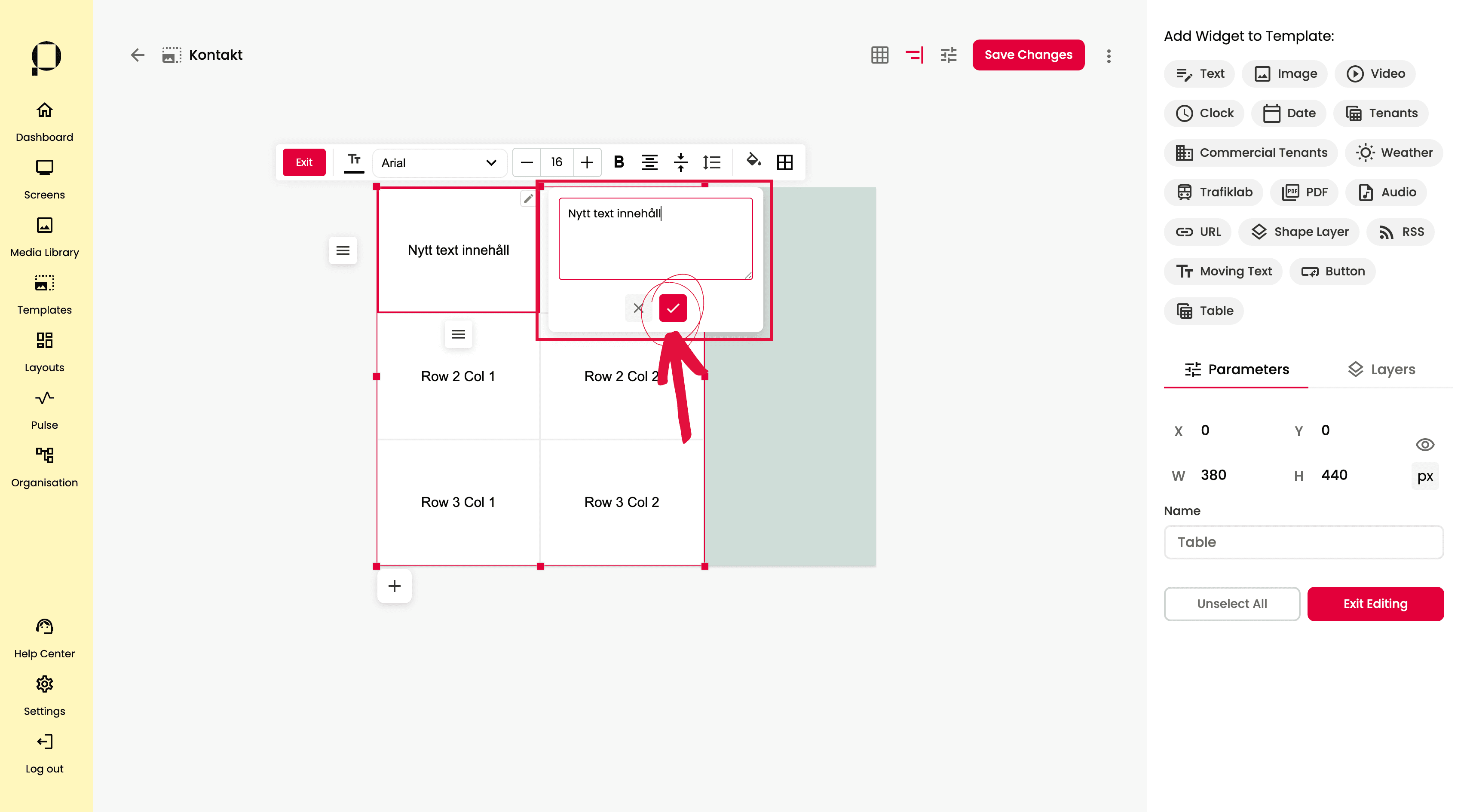
Redigering av textinnehåll görs i en pop up ruta. Spara förändringarna genom att trycka på checkrutan i rött.

Använd symbolen för kolumn– och radalternativ, till vänster respektive nedanför din markerade cell.

I menyn som öppnas ges du möjlighet att markera alla celler i rad/kolumn genom att välja ”Select all cells”.
Du kan addera rader/kolumner genom att välja ”Insert column left/right” för kolumner, eller ”Insert row above/below” för rader.
Du kan välja att radera rad eller kolumn genom att klicka på ”Delete row/column”.
Du kan ställa in radens/kolumnens vertikala/horisontella padding (inre marginal) genom att öka/minska siffervärdet med hjälp av pilarna.

När du redigerar textinnehåll, visas verktygsrad visas ovanför textfältet, med flera alternativ för att justera textformatet. Vi går igenom funktionaliteten i följande stycken.
💡 För att redigera textinnehåll, dubbelklicka på cellen.

Klicka på symbolen för textfärg för att redigera färg på texten i cellen.

Klicka på typsnittsfältet för att öppna val för textens typsnitt.

Justera textstorlek med plus- och minusknapparna.

Klicka på ”B” symbolen för att formatera cellens text som fetstil.
Justera cellens textjustering genom att klicka på justeringssymbolen och välja ett av de tre alternativen: vänsterjusterad, centrerad eller högerjusterad.
Justera textens vertikala justering genom att klicka på symbolen med pilar och välja ett av de tre alternativen: text i ovankant, text centrerad eller text i underkant.
Klicka på symbolen för radavstånd för textens radavstånd. Radavstånd avser det vertikala utrymmet mellan textrader, medan bokstavsavstånd styr det horisontella utrymmet mellan bokstäverna.

För att ändra bakgrundsfärg på cellen, klicka på symbolen för färgfyllning.

För att redigera cellens ram, klicka på symbolen föreställande ett rutnät.
💡 För att redigera flera cellers ramar samtidigt, håll in ”Shift” och klicka på cellerna, eller att klicka på en cell och håll i klicket medan du drar muspekaren över tabellen.
Du kan både justera ramens tjocklek (”Border Width”) och ramens färg (”Border Color”).
Det finns flera olika alternativ för visning av ram i tabellen, vilket gör det möjligt att anpassa både stil och utseende efter behov. Du kan till exempel välja mellan ”No borders” om du vill ta bort cellens ram helt, ”Horizontal Borders” för bara horisontell ram eller ”Vertical Borders” för bara vertikala ramar.
💡 Markera flera celler samtidigt för att få ett enhetligt utseende på din tabell, håll in “Shift” och dra över cellerna.
❗️Glöm inte att klicka på den röda knappen “Save Changes” för att bekräfta alla ändringar du gjort i din template.
Flersidig tabell

Om du önskar lägga till en sida i tabellen, klicka först gång på valfri cell för att öppna redigeringsläget. och klicka på plustecknet i underkant
Ett popup-fönster dyker upp ovanpå din tabell, där du ges valet att klona innehållet på den nuvarande sidan (textinnehåll och formatering).
Välj Yes för att klona innehållet, eller No för att få en blank tabellsida.
💡 Sidorna illustreras med växlande symbol för paginering i tabellens undre kant.

För att komma åt inställningar för widgetens sidor, klicka på symbolen för sidor.

Under ”Time per slide(s)” väljer du antal sekunder varje sida ska visas.
I ”Pagination section” styr du utseendet för pagineringen.
Väljer du färg på färg på den aktiva pagineringsmarkeringen under ”Dots Color” .
Styr bredd på padding (inre marginal) under ”V. Padding” . Styr placering av pagineringen under ”Alignment”, genom att välja ett av de tre alternativen: vänsterjusterad, centrerad eller högerjusterad.
Du kan välja att istället visa pagineringen som siffror genom att aktivera ”Pages in Text”.
Du kan välja att dölja pagineringen genom att avaktivera ”Show Pagination”.
Stäng menyn för inställningar för paginering genom att klicka på symbolen för sidor igen.

Använd pilarna för att navigera mellan sidorna.
Klicka på soptunnan för att radera den aktuella sidan.
❗️Glöm inte att klicka på den röda knappen “Save Changes” för att bekräfta alla ändringar du gjort i din template.
Sync Widgets
Sync är Piclers integrationshub som samlar alla integrationer på ett ställe. Sync består av fyra moduler: Tenants, Notify, Calendar och Visualize. Läs mer om Piclers integrationserbjudande här.
När du aktiverar en integration i någon av modulerna blir motsvarande widget automatiskt tillgänglig i widgetbiblioteket. Vid köp av en integration hjälper Picler alltid till att publicera dessa widgets.
Du kan sedan själv anpassa design och visuella inställningar när du redigerar en skärm eller mall, precis som med alla andra widgets. Guide för styrning av Sync widgets följer nedan
Tenants
Tenants är vår lösning för att presentera hyresgästdata. Sömlös synkronisering med ert befintliga fastighetssystem, paketerad i en en kraftfull och flexibel widget.
❗️Widgeten Tenants blir synlig i widgetbibloteket först då en integration kopplats på. För att koppla på integration för hyresgästdata, kontakta säljare här.
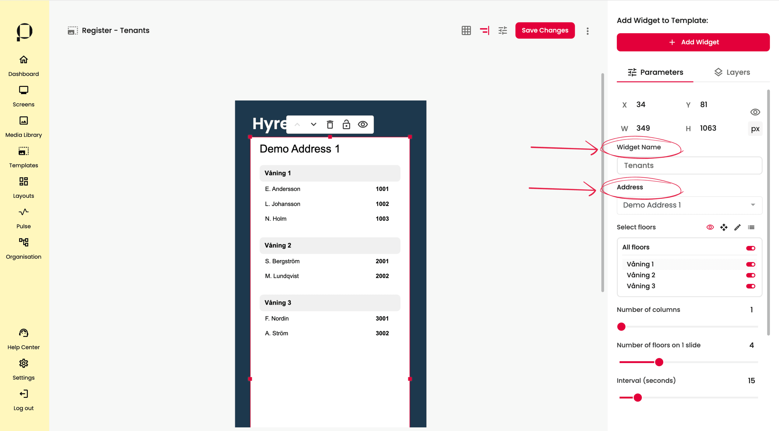
För att redigera hyresgästlistan i Tenants-widgeten, klicka på hyresgästlistan.
För att försäkra dig om att widgeten är markerad, kontrollera att sidomenyn till höger på skärmen visar Widget Name: Tenants (se skärmdump ovan).
I fältet “Adress” är adressen för widgeten konfigurerad. I exemplet ovan används en demoadress.

I sektionen “Select floors” har du möjlighet att styra och modifiera innehållet i widgeten.
Växla mellan de inrigade ikonerna (se skärmdump ovan) för att komma åt olika funktioner:
 – Justera visning av våningsplan
 – Justera ordning på våningsplan
 – Justera namn på våningsplan
 – Justera visning/ordning/namn (//) för hyresgäster

Styr widgetens upplägg genom att använda sliders.
Numbers of columns – Antal kolumner i widgeten
Numbers of floors on 1 slide – Antal våningar per slide
💡Team Picler ställer in passande värde för repsektive trapphus vid publicering av integrationn
💡T.ex. Om trapphuset har 5 våningar och du väljer att sätta värdet “Numbers of floors on 1 slide” till 3, så kommer trapphuset delas upp i 2 slides, där 3 våningar visas på första sliden och 2 våningar visas på andra slide. Sätter du värdet till 1, visas varje våning som en egen slide. Vi rekommenderar att prova sig fram för att hitta bäst lösning för respektive trapphus.
Interval (seconds) – Hur många sekunder respektive slide visas

Längst ned finns två expanderbara sektioner.
Under Name Customization styrs formattering av hyresgästnamn.
❗️En standardkonfiguration har ställts in vid uppsättning av integrationen. Vill du ändra formatering på alla dina hyresgästlistor, kontakta Piclers support så hjälper vi dig.
Under Visual Apperance styrs utseende för widgeten. Bakgrundsfärg, typsnitt, avstånd mellan rader och rubriker, textfärg och placeringar styrs under detta avsnitt.
🚀 Få ut det mesta av er integration med en snygg och tydlig design som går i linje med er grafiska profil! Picler The Studio erbjuder design och formgivning av hyresgästlistor på skärm. Kontakta säljare här.
❗️Glöm inte att klicka på den röda knappen “Save Changes” för att bekräfta alla ändringar du gjort i din template.
Notify
Notify är vår smarta notis-widget integreras med ert befintliga system för notiser och information till er målgrupp.
❗️Widgeten Notify blir synlig i widgetbibloteket först då en integration kopplats på. För att koppla på integration för information eller meddelanden, kontakta säljare här.
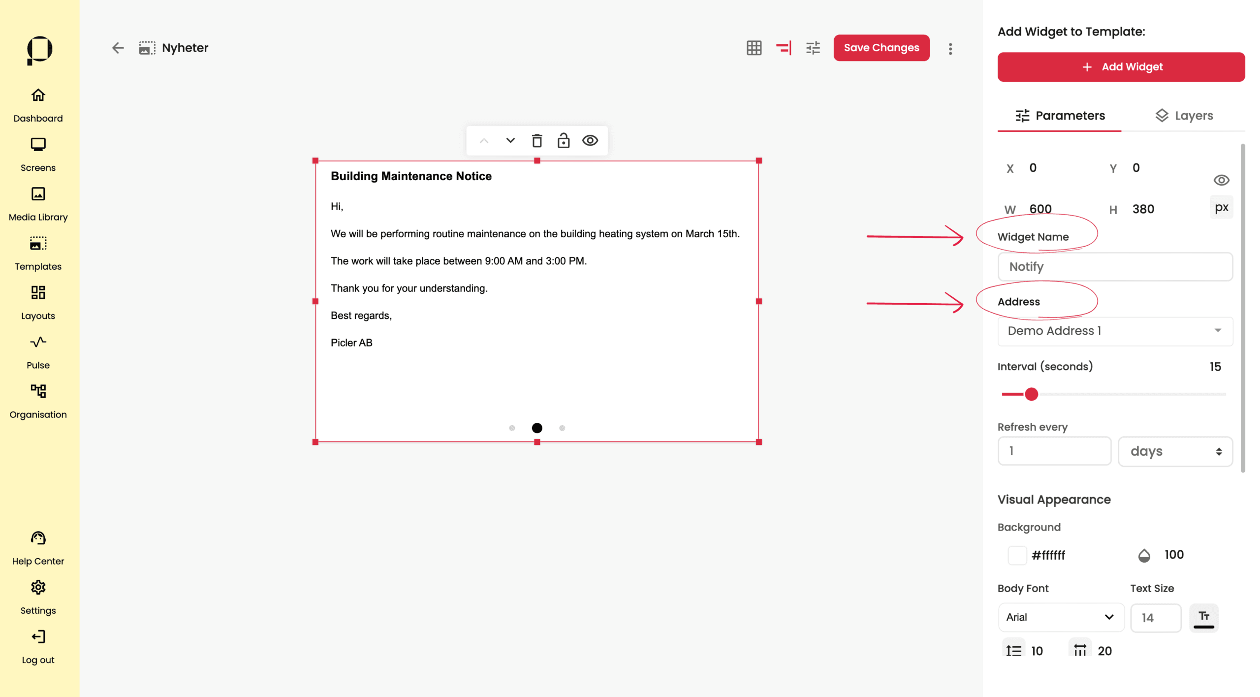
För att redigera Notify-widgeten, klicka på meddelandet i templaten.
För att försäkra dig om att widgeten är markerad, kontrollera att sidomenyn till höger på skärmen visar Widget Name: Notify (se skärmdump ovan).
I fältet “Adress” är adressen för widgeten konfigurerad. I exemplet ovan används en demoadress.
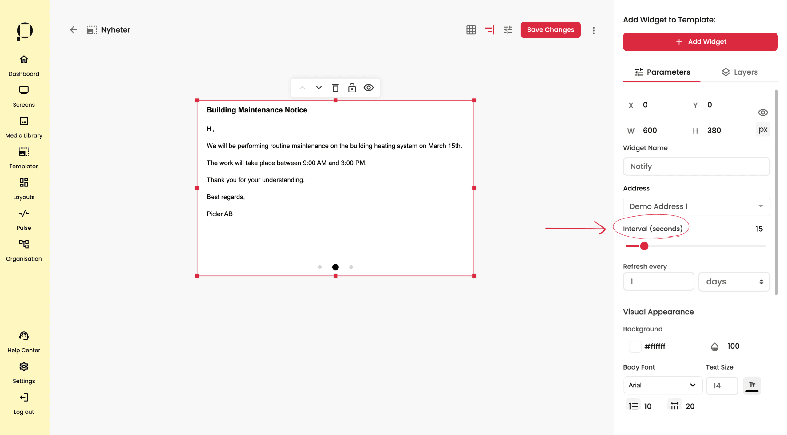
I slidern för Interval (seconds) styr du hur många sekunder respektive meddelande ska visas i.
💡 Observera att funktionaliteten endast fungerar om du har flera meddelanden
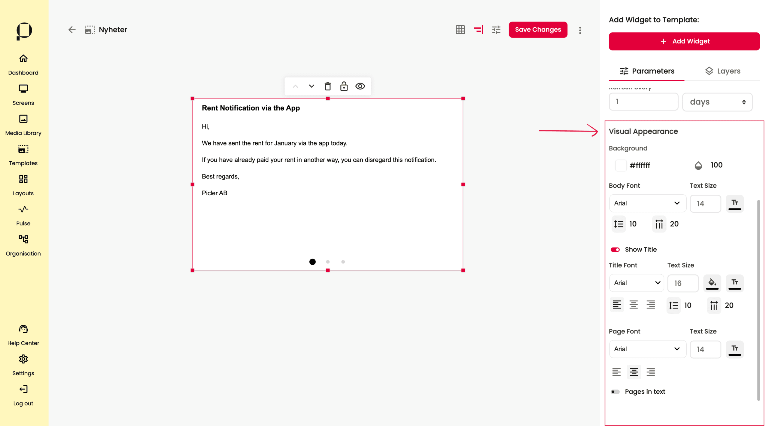
Längs ner under Visual Apperance styrs utseende för widgeten. Bakgrundsfärg, typsnitt, avstånd mellan rader och rubriker, textfärg och placeringar styrs under detta avsnitt.
🚀 Få ut det mesta av er integration med en snygg och tydlig design som går i linje med er grafiska profil! Picler The Studio erbjuder design och formgivning av era integrerade meddelanden Kontakta säljare här.
❗️Glöm inte att klicka på den röda knappen “Save Changes” för att bekräfta alla ändringar du gjort i din template.
Calendar
I widgeten “Calendar” har du möjlighet att integrera mot en befintlig kalender som ligger hos Outlook, Google eller Apple.
För att integrera behöver du en prenumerationslänk (ICS-länk) eller prenumerationsfil (ICS-fil) för din kalender.
Följ våra snabbguider nedan för att hitta korrekt länk:
📅 Google kalender prenumerationslänk
- Gå till Google Calendar i webbläsaren (https://calendar.google.com/calendar/)
- I vänsterspalten: håll över den kalender du vill visa data ifrån → klicka på ⋮ (tre prickar)
- Välj Inställningar och delning
- Klicka på Integrera kalender
- Kopiera Hemlig adress i iCal-format → detta är din ICS-länk
📅 Outlook kalender prenumerationslänk
- Gå till Outlook Calendar i webbläsaren (https://outlook.office.com/calendar/)
- Gå till Kalender → Delade kalendrar
- Under Publicera en kalender:
- Välj den kalender du vill visa data ifrån i dropdown-listan “Välj en kalender”
- Välj behörighet (t.ex. “Kan visa alla detaljer”)
- Klicka Publicera
- Kopiera ICS-länken
📅 Apple kalender prenumerationslänk
- Gå till iCloud.com → Kalender
- I vänstra sidopanelen, håll muspekaren över den kalender du vill dela. Klicka på delningsikonen (symbol föreställande en person)
- Toggla på Offentlig kalender
- Kopiera länken som visas. Viktigt! Om länken början med webcal ska detta ersättas med https när den klistras in i widgeten i PicFlow
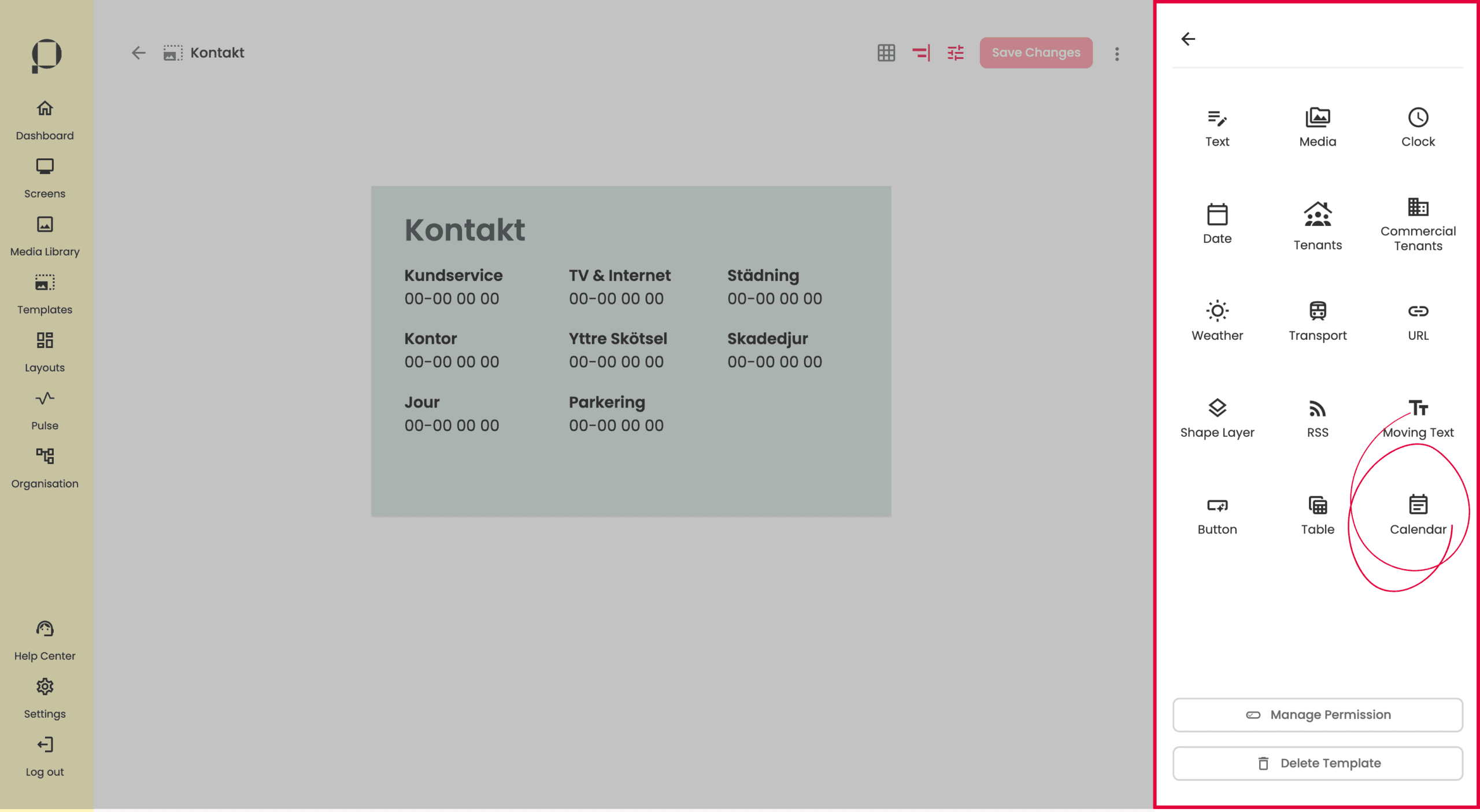
För att addera widgeten till din template, klicka på “Calendar” uppe till höger på skärmen.
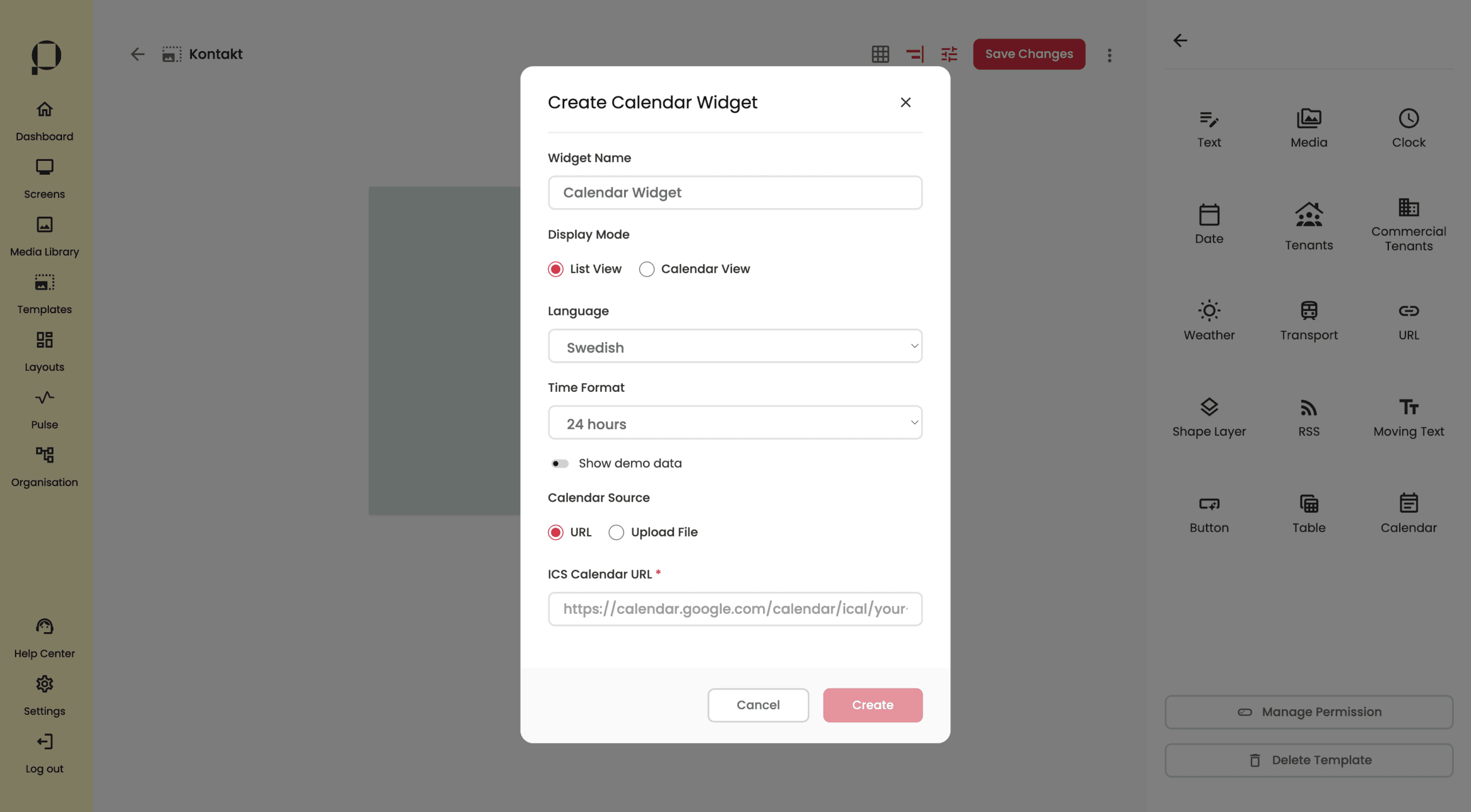
I det pop up fönster som visas kan du göra ett antal olika inställningar för kalendern.
Du kan t.ex. välja mellan våa två visningslägen, “List view” som visar dina händelser i en lista eller “Calendar View” som visar en mer traditionell kalendervy. Alla dessa inställningar går att justera efter widgeten är skapad, och vi går därför igenom dem mer noggrant senare i detta avsnitt.
Det viktigaste inledningsvis är att lägga till en kalenderkälla i form av ICS-länk eller ICS-fil under “Calendar Source“.
Efter att du klistrat in länken, klicka på den röda knappen “Create“.
Kalenderwidgeten dyker upp på templaten. Greppa widgeten genom att klicka på den.
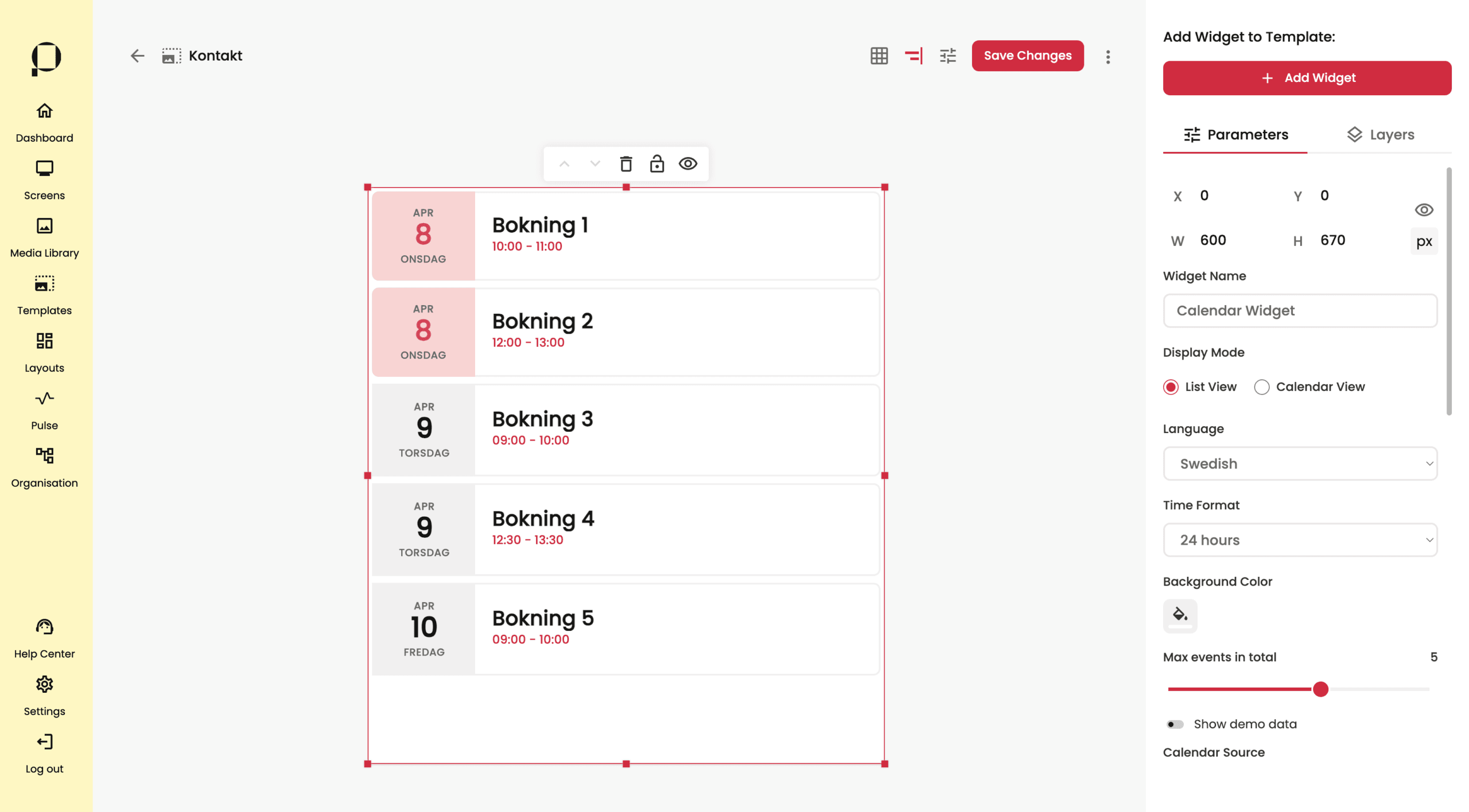
I exemplet ovan visas en kalender i läget “List View“, alltså en listvy över kommande kalenderevent.
Du kan ställa in hur många event du maximalt vill visa i listan under “Max events in total” längre ned i sidomenyn.
Det event som ligger närmast i tiden är alltid först i listan. Dagens datum indikeras av en en highlighter-färg som kan bytas under “Current Day Highlighting” längre ned i sidomenyn.
💡 Tips: Vill du visa din kalender i en smal yta är troligtvis “List View” det bästa alternativet.
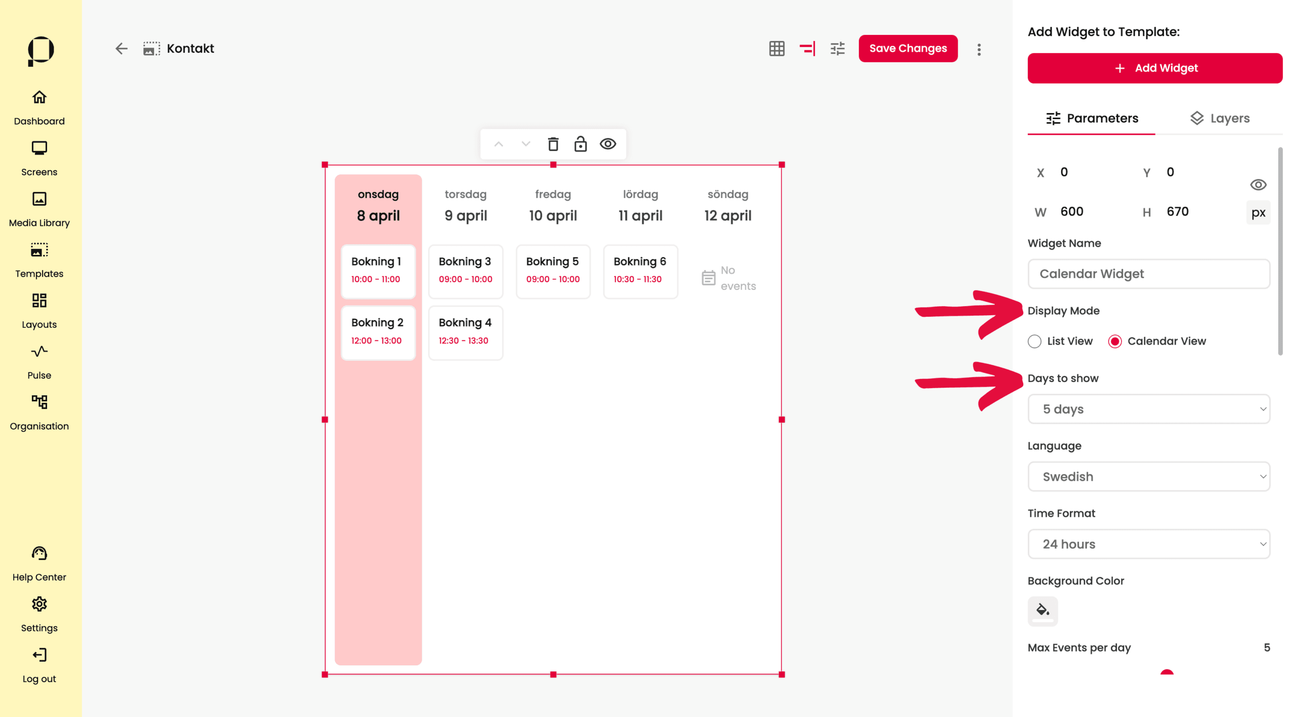
I bilden ovan har vi bytt visningsläge till “Calendar View” under “Display Mode” och får då en mer traditionell kalender vy.
💡 Tips: “Calendar View” gör sig bäst i en bred yta.
Under “Days to show” väljer vi hur många dagar framåt vi vill att kalendern ska visa. Dagens datum är alltid först, och indikeras av en en highlighter-färg som kan bytas under “Current Day Highlighting” längre ned i sidomenyn.
Du kan ställa in hur många event du maximalt vill visa per dag under “Max events per day” längre ned i sidomenyn.
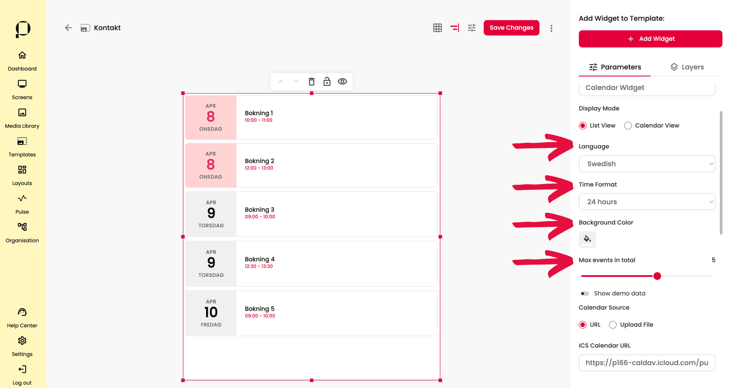
Justera widgetens språk respektive tidsformat under “Language” respektive “Time Format“.
Du kan även ge widgeten en bakgrundsfärg i färgväljaren under “Background Color“.
I slidern under “Max events in total” ställer du in hur många event du maximalt vill visa i listan (om du använder “List View”) eller per dag under”Max events in total” (om du använder dig av “Calender View”).
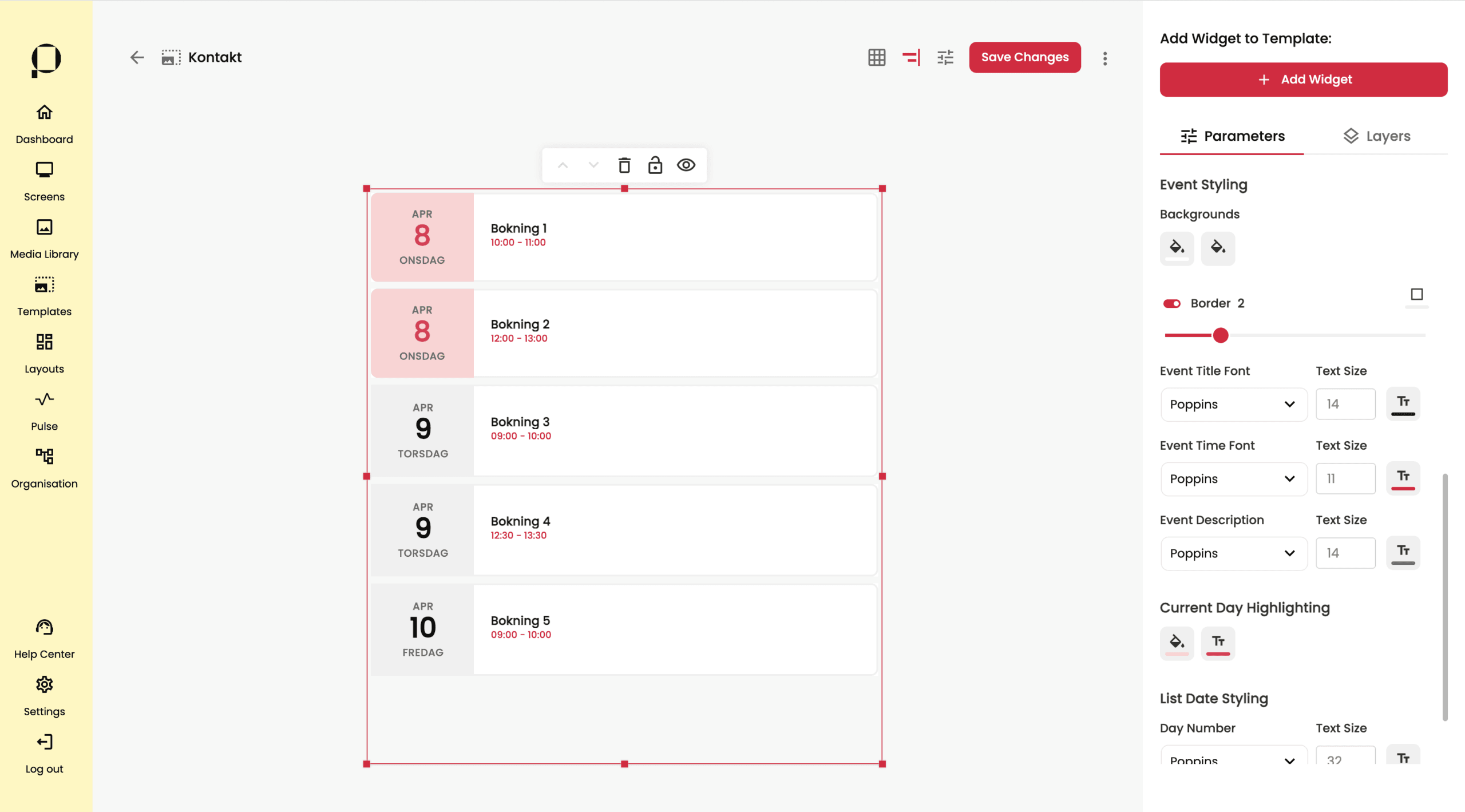
Längre ned i sidopanelen, under Event Styling finns goda möjligheter att anpassa kalendern efter önskat utseende. Du kan både justera textstorlek, textfärg och typsnitt på samtlig text i widgeten samt highlighter-egenskaper för dagens datum.
❗️Glöm inte att klicka på den röda knappen “Save Changes” för att spara alla ändringar du gjort i din template.
Visualize
Back to Top